Saturday 2 October 2010

Ged Quinn
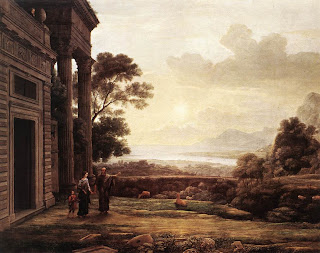
The Fall, 2006
Oil on Canvas 153 x 250cm
Saatchi Gallery, London
19 August 2010

I must admit I was a little disappointed with the Newspeak: British Art Now (Part 1) exhibition at the Saatchi Gallery, there was certainly some quality work, but overall it lacked the impact of the Sensation exhibitition at the Royal Academy in 1997.

One of the artists that did catch my eye was 47 year old Cornwall based painter, Ged Quinn. Several of Quinn’s large landscapes and still lives shared a room with Sigrid Holmwood’s pastich fluorescent paintings of early Van Gogh. Quinn draws on an even earlier source of inspiration, the feathered landscapes of Claude Lorrain.


“The Fall” is based on the Claude’s Arcadian setting for his 1668 painting “The Expulsion of Hagar” to which Quinn has added poet and dramatist Antonin Arnaud falling from the sky towards a ramshackle burnt out shed. The painting is clearly layed with meaning and the references from recent history becomes “blots” on the Romantic styled landscape. The shot down Antonin Artaud, the creator of the Theatre of Cruelty, is swathed in combat-plane camouflage refers to Lucifer's fall from grace in Milton's Paradise Lost. The shed is Thomas Edison's first purpose-built film production studio, the “Black Maria”, and it is decorated with Artaud's work. I must admit to a weakness to spending time trying to work out the references in his paintings rather than trying to decipher what the whole might mean.


In the Theatre of Cruelty, Artaud was trying to revolutionise theatre - figuratively burn it to the ground so that it could start again. He was trying to connect people with something more primal, honest and true within themselves that had been lost for most people. He believed that text had been a tyrant over meaning, and advocated, instead, for a theatre made up of a unique language that lay halfway between thought and gesture. This has interesting parallels with the theory surrounding the death of painting and provides us with the link to the film industry, where everything is false. Artaud believed in physical expression, something lacking in Claude’s “old fashioned” picturesque landscape painting. It is typical of the mediated vision of the ideal landscape that we all have in our mind's eye and is no longer radical, any power it once had has been bled away by mechanical reproduction.


A knowledge of the subject of the original Claude painting may provide a different interpretation, it shows Hagar and Ishmael being banished into the desert of Beersheba by Abraham. The original is set in the cool light of morning and is paired by a second painting (a pendant) set in an evening desert landscape when the archangel Michael appears to the sorry couple and leads them to a well, saving them from dying of thirst. In Quinn’s painting centuries have passed, Hagar and Ishmael long gone, the temple derelict and fragments of columns and pediments lying in the foreground, but the cool light of dawn remains. Is this the truth that Quinn wants to represent in his “Theatre of Cruelty”?

©blackdog 2010

Saturday 28 August 2010

Albrecht Dürer

British Museum, London
Not Seen
Melencholia I, 1514
Engraving, 23.7 x 18.7 cm


The idea of a melancholic as someone given to profound contemplation, was developed by the work of Italian philosopher Marsilio Ficino. Ficino not only rehabilitated the “Aristotelian” notion of the gifted melancholic , but expressly tied it in with the Platonic notion of “divine frenzy”, thereby laying the intellectual foundations for a new type of man, the “homo literatus” or tortured genius, pitched back and forth between the heights of rapture and the depths of despair. Albrecht Dürer gives a visual interpretation of Ficino’s ideas in his 1514 engraving Melancholia I. According to Erwin Panofski, the woman in Dürer’s engraving displays “artist's melancholia”; a figure being endowed with intellectual power and technical accomplishments of an 'Art', yet despairing under a cloud of black humor.


Representations before Dürer’s seminal work illustrated melancholia by showing a woman or a man asleep at their work.[1] Dürer's Melancholia though is super awake; her fixed stare is one of intent though fruitless searching. She is inactive not because she is too lazy to work but because work has become meaningless to her; her energy is not paralysed by sleep, but by thought. She is a thinking being in perplexity; not contemplating a lost object, but thinking about her insight into a problem that cannot be solved, resulting in impotence and gloom.

“The picture is at once immediately legible and deeply ambiguous. Seated on a step outside a narrow building with a ladder leaning against it is a winged angel. Her right arm rests on a book in her lap, the hand holding a compass; her left hand supports her head. Hanging from the belt of her long, rumpled skirt is a set of keys and a purse. Seated on a millstone to her right is a plump little putto bent studiously over a slate, and, curled up asleep next to the millstone, a scrawny-looking dog. Strewn about the ground are a variety of tools and instruments – a self-feeding furnace, or athanor, a polyhedron with a hammer lying beside it, a sphere, a set square, a pair of pincers, a plane, a handsaw, a ruler, three nails, and some sort of syringe. Fixed to the wall of the building are a set of scales, their pans exactly balanced, an hourglass with equal amounts of sand in each bulb, a bell at rest, and a “magic square” composed of sixteen smaller squares, each inscribed with a number so that whichever way you read the numbers (vertically, horizontally, diagonally) they always add up to thirty-four. In the background is a stretch of coastline overlooking an alarmingly calm lake or sea, and in the sky a comet, a rainbow and a batlike figure brandishing a streamer with the inscription “Melencolia I”. The scene is steeped in a lugubrious grey twilight” .[2]

In his analysis of the engraving Panofski describes the figure as being: lapsed into a state of gloomy inaction, neglectful of attire with her head on her hand (clenched fist), her face overcast by deep shadow and eyes raised in a lowering stare. He concludes that she is in a state of torpid dejection and careless desolation, a creative being brooding in idleness reduced to despair by insurmountable barriers to higher realm of thought. Thereafter, the posture and demeanour of Dürer's Melancholia became the touchstone for artistic depiction of melancholia. Lucas Cranach uses a similar posture for his four versions of An Allegory of Melancholy dated 1528, 1532, 1533, and 1553 and in each case a woman sits staring into space. A century later the frontispiece for the 1638 edition of Robert Burton’s text The Anatomy of Melancholy shows figures with their head on one side, resting on their hands.

[1] According to Erwin Panofsky the commonly held view of the Melancholic was someone characterised as: Thin and swarthy, awkward, miserly, greedy, malicious, cowardly, faithless, irreverent and drowsy. Surly, sad, forgetful, lazy and sluggish, shuns the company of other men and despises the opposite sex. Only redeeming feature is a certain inclination for solitary study.
[2] Mark Hutchinson, The Art of Melancholy TLS 2005

Saturday 31 July 2010

Walter Sickert
Ennui, 1914
Oil on Canvas 152 x 112cm
Tate Britain, London
15 February 2008

The exhibition was of work by the Camden Town Group of painters, who “inspired by the work of van Gogh and Gauguin on the continent, introduced Post-Impressionism to Britain”. This may be the case but in my opinion the biggest influence on Sickert is Degas, using many of his themes such as the music hall and the domestic environment to justify a model’s nudity.

It is interesting that he made full use of titles to add drama to the paintings suggesting a narrative for the work that certainly engaged with life. Ennui is a good example of both his use of titles and domestic interiors as a setting for psychological tension. I have seen this painting several times now and still think it is one of his finest.


The canvas is one of his largest and is based on sketches of two models, Hubby and Marie, that he used for a number of his domestic interior scenes. The painting depicts the couple overlapped in a tight corner of a sitting room, their gazes are diametrically opposed. He looks out of the canvas to the right whereas she looks into the corner of the room on the left. Above her head a painting of a carefree woman ‘looks’ over a balcony into the room. They are both absorbed in themselves.

It can be no accident that there is a bell jar full of stuffed brightly coloured birds on the chest of drawers. The inference is that the woman is both bored and trapped and the title of the painting makes sure we don’t miss the point. It is a mood that has strong melancholic associations and one can imagine the despondent Marie as the protagonist in Alberto Moravia’s 1960’s novel La Noia who states in the prologue that “nothing that I did pleased me or seemed worth doing; furthermore, I was unable to imagine that anything could please me, or that could occupy me in a lasting manner”. This isn’t the melancholy beauty of the symbolists but a mourning of the loss of purpose (or perhaps freedom in this case) such that the melancholic person thus retreats into a state of inactivity, superbly shown by Marie staring into the corner with vacant mindlessness.

In front of her sits Hubby, leaning back in his chair smoking a cigar at a table with a glass of water, staring into what Virginia Woolf described as “the intolerable wastes of desolation in front of him” . His body language is of one set in his ways and the viewer perceives that the accumulated weariness is such that the situation isn’t going to change.

The tight interior space and the arbitrary crop of the fireplace and yellow chest of drawers give an almost claustrophobic atmosphere to the room and remind me of a photographic snapshot. The painting is built up of several layers of thinly scumbled opaque paint giving a very lively surface but I don’t think it contributed to the atmosphere of melancholia as it does in his earlier sequence of pictures with the collective title ‘The Camden Town Murder’ where the brushwork is much coarser and totally in keeping with the subject matter.

[1]Woolf, Virginia quoted in Walter Sickert: the Human Canvas 2004 Abbot Hall Gallery Kendal 62

©blackdog 2010

Sunday 27 June 2010

Vincent van Gogh
The Sower, 1888
Oil on Canvas 32 x 40cm
Royal Academy, London
10 March 2010

Unfortunately the recent exhibition of van Gogh’s letters, drawings and paintings proved to be so popular that it was difficult to even stand still in the press of the crowds in the Royal Academy. However, there were a lot of fine paintings on display and it was especially interesting to see them accompanied by his descriptive letters.

I had gone with the intention of reviewing his portrait of the stoic and melancholic looking Madame Ginoux (L’Arlesienne, 1888) but instead I was captivated by a small jewel like version of The Sower painted in the same year. It is a theme he had addressed several times before, originally inspired by the work of Jean-François Millet, a painter who idealised the ‘monumental’ work of French peasants.


This version is very much his own though, and shows the influences of Japanese prints on his style. In a letter to his brother Theo from around 21st November of 1888, Van Gogh drew a sketch of the Sower and described the colours he was using “Here’s a croquis of the latest canvas I’m working on, another sower. Immense lemon yellow disc for the sun. Green-yellow sky with pink clouds. The field is violet, the sower and the tree Prussian Blue”[1] . The faceless sower works on the left of a canvas divided by a pollarded willow, a motif that had appeared in a watercolour sketch from 1882. The landscape is schematic and flat, but a strong diagonal leads the eye to the huge yellow ball of the setting sun that almost becomes a halo for the working peasant.

The colour is laid on with short definite brush marks with all the energy of someone working hard against the clock. This energetic expressive brushwork not only adds to the vibrancy of the colour in the painting but also serves to dispense with some elements of ‘reality’ in order to highlight others, particularly the sense of twilight. The lavender touches to the fields provide a strong complimentary contrast to the sun making it jump forwards. But despite the strength of the yellow, there is a darkness to the image, as both the foreground subjects, the sower and the tree, appear as dark silhouettes. It is this combination of denial of detail and unusual colour choices, such as the lime green skies casting a sickly pallor over his homestead on the horizon that perhaps reveal a hidden truth about van Gogh’s version of reality and gives the painting its melancholic feel.

[1] Letter 772 (To Theo van Gogh. Arles, on or about Wednesday, 21 November 1888) http://vangoghletters.org/vg/letters/let722/letter.html

©blackdog 2010

Saturday 29 May 2010

Anselm Kiefer
Karfunkelfee 2009
Gold paint, chemise, jesmonite, snake, brambles, concrete, acrylic, oil, emulsion, ash and shellac on canvas in steel and glass frame. 332 x 576 x 35cm
White Cube, London
30 October 2009

This was the first exhibition I had seen of Kiefer’s work in a commercial gallery. The work compromised a series of forest diptychs and triptychs displayed in glass and steel vitrines. The exhibition was titled ‘Karfunkelfee’, after a poem by the post-war Austrian writer Ingeborg Bachmann.

"On the Golden bridge, only he who might know the fairy’s secret word can win. I’m sorry to say, along with our last snow, it melted in the garden.”


Of the four huge works in the exhibition I have chosen the title piece to review. Karfunkelfee roughly translates as Carbuncle Fairy, an ambiguous figure from fairy tales who may be good or evil. As Kiefer explained in an interview with Tim Marlow, the word Karfunkel has two meanings; it is firstly a precious stone but also associated with ergot, a fungus that that grows on wheat and other crops turning them black. Human poisoning due to the consumption of bread made from ergot-infected grain was common in Europe in the Middle-Ages. Interestingly, ergot is known in German as ‘the tooth of the wolf’ and may be connected to the Anglo-Saxon poem Beowolf.

This would certainly be of interest to Kiefer, who since the 1970’s has made art that alluded to Teutonic myths, Wagner, and the Black Forest; an artist celebrating German history whilst acknowledging the guilt of its fatal collision with Jewish history that culminated in the Holocaust. Kiefer was taught by Joseph Beuys in Dusseldorf and both the use of found materials and the sombre palette are obvious influences in his work. Unlike Beuys though, his chosen medium was painting and like Georg Baselitz, he reprised the painterly style of expressionism, alluding to emotion in his work rather than truth.

Kiefer’s process is to start with a normal canvas and apply a 75mm thick pigment layer that cracks on drying and then place these in vitrines to make a threshold distancing the viewer from the painting. The background image is a forest on a hillside covered in snow and the trees are painted with dark slashing strokes. He adds items between the canvas and the glass of the vitrine that relate to the theme of the work, in this case a snake, Moroccan thorns, scattered teeth and an empty hooded smock. The result of these boxed in memories is not unlike a display cabinet in a natural history museum. Although there is an absence of figures, a human element is acknowledged through the inclusion of the floating empty hooded smock in the central vitrine. The perfect metaphor for the ambiguous Karfunkelfee.

The work has a portentous melancholy to it but I cannot help feeling that the symbolism is too overt, too carefully (artfully) arranged and that this reduces the force of the impact. This manipulation of his Expressionist inheritance in order to give an authorial mark of emotion risks the viewer doubting the psychological depth of the work (more message than feeling). [1]

[1]Paraphrased from Rosalind E Krauss in The originality of the avant-garde and other modern myths 1984 MIT Press 194

©blackdog 2010

Sunday 2 May 2010

Giorgio Morandi


Still Life, 1962
Oil on canvas 30.5 x 30.6cm
Tate Modern, London
1st June 2001

This was the first time I had seen his work and in all honesty I couldn’t remember any specific painting from the show, only the overall impression the body of work made. Consequently I have chosen a painting that was in the show, but that I have had chance to see at the National Gallery in Scotland subsequently.

The impression the Tate Exhibition left with me was one of incredible uniformity, each painting was a small still life and in one room the same objects in the paintings were repeated over and over. The palette throughout was predominantly muted colours and I have since learned deliberately referenced the colours of his home town, Bologna. Because he painted his bottles and boxes without any labels the arrangements were more about form than representation.


Although I went through the exhibition quite quickly and missed the immense complexity within the subtle variations of composition, I did spend enough time with a couple of paintings in the exhibition to appreciate their qualities of quietness and spatial harmony. I also remember preferring the later more abstract style of painting where the still life objects were arranged in a non-conventional way. So I was pleased to revisit this example of his later style in 2005, when I was more attuned to the quality of the nervous scumbled brushwork and the light that emanated from the surface. I was also aware of the significance of the tightly grouped objects that suggest to some the skyline of Bologna and to others family portraits.[1]

Looking at the work later I was also able to appreciate, in retrospect, that the painting was more about the idea than the things he saw, and that they were devoid of narrative. Yet he did paint from actual objects rather than from his imagination. The photograph of his studio shows a reconstruction of a typical set up for one of his paintings. Morandi once commented that 'For me nothing is abstract. In fact, I believe nothing more abstract, more surreal, than reality'.[2]


In this canvas I certainly felt there was more to it than the physical surface of the image, an aura which maybe because of my own circumstances at the time, I sensed as melancholic. It is something to do with the two black bottles cowering in front of the white vases, something edgy and uncertain. From a distance I find it hard to say whether I was feeling the artist’s intentions or if I was projecting my own sense of loss, but perhaps that doesn’t matter. I certainly didn’t see a skyline, but I did sense a family portrait where some of the members were lost.

[1] In fact I have since read that Darian Leader postulates in his book “The New Black: Mourning, Melancholia and Depression” that Morandi’s repetition and rearrangement of motifs might not just resemble family portraits, but also may indicate an arrested or stagnation of the mourning process


Leader, Darian The New Black 2008 Hamish Hamilton 30


[2] Quoted on Tate Modern webpage http://www.tate.org.uk/modern/exhibitions/morandi.htm

©blackdog 2010

Sunday 28 March 2010

Lara Viana
Mirror 2008
Oil on Board 47 x 40 cm
Domo Baal, London
11 March 2010

I have been following this artist since her MA show at the RCA in 2007and it was a pleasure to see her first solo show in London. There were many interesting paintings, most involving a melancholic theme, sympathetically hung in an interesting gallery space on the first floor of a London town house.


The one I have chosen is Mirror [1] and depicts an ornate frame of a mirror that hangs on a wall decorated with a floral pattern. A couple of substantial leaves intrude from the left of the image and it is hard to tell if they are part of the wall or in the space that the mirror occupies.

The frame itself is an interesting device in painting both dividing up the space and focussing our attention on the space contained by it boundaries. It reminds us that we are looking at a representation, drawing our attention to the artificial nature of what we see.

In this case what we see within the frame is ambiguous, it could be that because of the oblique angle the mirror is reflecting what is behind us, or it could be the artist’s representation of the ‘void’. What is important is that we are aware that it is a representation or ‘sign’ of nothingness and we have registered its artificiality. This transformation has important parallels in the mourning process where a mourner finds ways of representing reality, emptying it out and assigning the haunting aspects of the reality of loss to a representation. [2]  In other words this painting works on two melancholic levels; it is a depiction of the “void” or nothingness and it references the process of making the reality of loss artificial by inscribing the idea of the loss in a symbolic space.

This notion of loss and artificiality is reinforced by the paint handling which is a mixture of fast soft brush strokes (the wall) contrasted by more definite strokes for the objects (the frame and the leaves). The use of medium to deteriorate the top edge of the frame on one side introduces the notion that the image is of something half-remembered (she works from found photographs) and intrudes into the framed area where the surface of the paint is dragged into a blurry tonal ‘reflection’. The blur could denote a misted surface to a mirror but as I suggest above I think it connotes the ‘void’. The colours are muted and the paint thin and transparent, allowing the primed surface to shine through, illuminating the image.

I have to confess to liking her paintings a lot, perhaps unsurprising as her brushwork is very similar to my own, in particular her ability to make an image that evokes the half remembered, leaving plenty of room for our own narrative.

[1] Photograph courtesy Domo Baal London
[2] Leader, Darian The New Black 2008 Hamish Hamilton 100-105

©blackdog 2010

Sunday 28 February 2010

Michael Raedecker
Tipping Point 2007
Acrylic and thread on canvas 198 x 336 cm (3 parts)
Hauser and Wirth, London
27 September 2007

I always find the wood panelled rooms of this old bank building a strange space to exhibit large contemporary paintings. This show of a mixture of Michael Raedecker’s work was no exception. The subject matter covered the familiar modernist houses, flowers and ruins. The stand out piece for me though was the line of washing drying in the garden. An idea I had had for a painting, but beaten to once again.

I first saw his work in 2000 when he was nominated for the Turner Prize for his fresh approach to painting and his use of unusual materials, the same year as Glenn Brown. He combines thread and paint on the surface, using the stitching to give forms an outline and helps delineate the subject matter. Raedecker takes his images from such disparate sources as Dutch still life painting, photographs of modernist architecture, B-movie scenes and antiquated gardening catalogues creating images that look like film noir sets waiting for actors to come out of the shadows .


Tipping Point is a very large three panel painting that is so sparsely covered with shades of near white that it is hard to make out the banal subject of washing hung on a line. Without the embroidered description this austere image would be taken for an indulgent modernist abstraction. Yet by defining the subject matter on such a bleak surface, it raises disturbing narrative possibilities that nag at our consciousness. The shirts and sheets are blowing in the breeze but this isn’t a washing powder advertisement, this is our dirty washing hung out to dry. It is very difficult to convey in the photograph, but the subtle changes in tone create strange halos of light which radiate from the image making the washing looks like it is dirty. It is this effect that gives the painting its latent power; we note the absence of any human figures, but conditioned by contemporary film and television drama we know something bad is going to happen. The tipping point has been reached.

©blackdog 2009

Wednesday 3 February 2010

August Strindberg
Purple Loosestrife, 1892
Oil on Canvas
Tate Modern, London
10 May 2005

I was surprised how much I enjoyed this exhibition, I found it both charming and melancholic and was interested to read that he was a Gemini and prone to mood swings. Strindberg was clearly influenced by Northern Romantic [1] landscapes, but had his own expressionist way of painting that relied more on the palette knife than the brush. There were many of Strindberg's dark brooding seascapes that shared a single man-made object at the mercy of the elements: a buoy in the midst of a stormy sea, or a startlingly white navigational mark against a tempestuous sky. Several paintings of lighthouses conveyed a similar mood reflecting his inner turmoil, but most interesting were his astonishing delicately painted pictures of wild flowers set against a very loosely knifed / brushed landscape. If these earlier solitary flowers are also to be read as symbolic self-portraits he chose very unappealing plants, thistles, toadstools, and "weeds".


Purple Loosestrife is typical of the genre, with the painting divided by a pronounced horizon and the plant a small element isolated in the landscape. The mark making is vigorous but the mood is serene and melancholic, he uses a buttery yellow thickly applied with a palette knife for the foreground gradually merging with a blue/white shoreline and then above the horizon line similar blues and whites for the sky but painted in a different style. He was clearly an acute observer of nature and the plant named in the title is painted with accurate botanical detail, causing it to stand out sharply against the loosely painted landscape.

These small flowers in the vast landscape reminded me of the paintings of Caspar David Friedrich that also use the shoreline as a metaphor for the daunting vastness of the world. Whilst it isn’t as dark as Friedrich’s Der Mönch am Meer, for example, it shares some of that painting’s depiction of the sublime; a boundless, silent, solitude. These qualities were typical of all these paintings of solitary flowers that were painted on the shore south of Stockholm and even more pronounced in some e.g. in Lonely Poisoned Mushroom (also 1892) there is no clear division between the land, sea and sky. I found myself reacting to the emptiness in these calm paintings much more than the violent seascapes, as at least in those there was the storm to provide a narrative!

[1]Strindberg wanted Bocklin's painting “The Island of the Dead”, to serve as the final image of his 1907 play The Ghost Sonata

©blackdog 2009

Sunday 3 January 2010

Leon Golub
Interrogation II 1981
Acrylic on Linen 305 x 426 cm
Irish Museum of Modern Art
19 September 2000

This was an immense exhibition of over 80 piaintings by this American artist and the first time I had seen his work first hand or in reproductions.

Totally unprepared, the shock of seeing so many of these larger than life scale paintings of oppression and cruelty was palpable. Golub's massive unframed canvasses depict scenes of mercenary killings, torture, and death squads. The show made me feel uncomfortable long after I had left and I could have chosen many individual works to write about, but this one stuck in my mind.


Like the other 38 large scale works it is on unframed but primed canvas that like sailcloth has had large eyelets attached to allow the work to be stretched. He works from an image bank of collected newspaper and magazine clippings and photographs of various body types, violent acts, and weapons. Then using these photographs as models, he draws directly onto the large canvas and then applies layer upon layer of paint, scraping back and reworking the surface in the process. The result is an expressionist surface where the figures, although unified by the process, lack any modelling making them as flat as the space they occupy.

The interrogators of the title are not specifically located, but through the device of flattening the image plane with the red oxide ground and cropping the legs, a continuity of space is suggested between them and you, the viewer. This breakdown of the gap, the enlargement of the protagonists and the direct eye contact they make suggests not only their power, but also makes you feel involved and complicit.

This ability to take the viewer into areas restricted from the public gaze took a dramatic shift with the images of torture that came out of Abu Ghraib in 2004, making Golub’s images of Mercenaries posing for the viewer/camera seem prescient. However, this need to expose the suppression of similar kinds of torture by the state is not new in art and Goya’s Disasters of War series of etchings from 1808-20 are clearly an influence on Golub’s work as might be Max Beckmann’s 1919 painting The Night.

Unlike those works and despite a process that implies loss (the painting and scraping back of the image, eroding and reconstructing the image) I don’t find the image melancholic. Is this something to do with the denial of the victim’s identity? Perhaps the victim as a sacrifice allows him to become a scapegoat and we fail to identify with his suffering.

These are not images to be seen in a book, as the predominant aura comes from the power of the mercenaries and their invasion of the viewer’s space and the work requires the audience's participation to make it complete. Consequently, whilst we may deplore the torture, part of us is relieved that it’s not us under the hood, and the knowing looks of the men drive home our complicity in the almost pornographic action. Maybe that’s the inherent sadness of the image, not man’s inhumanity to man, but the fact that like hard core pornography it is supposedly done for our benefit?

©blackdog 2009