Tuesday, 31 March 2009

Dirk Skreber

Untitled (The New House of Usher) 1997
Oil on Canvas 300 x 170cm

White Cube Hoxton
8 April 2008

You Dig the Tunnel, I’ll Hide the Soil’ was a group exhibition to pay homage to Edgar Allen Poe’s bicentennial in 2009. The show was curated by artist/writer Harland Miller and staged at both the White Cube Hoxton Square and Shoreditch Town Hall, and features the responses of contemporary artists to the American writer. There were a number of interesting and thought provoking works, and those shown in the dilapidated cellars of Shoreditch Town Hall were shown to considerable advantage.


This particular painting was hung in the White Cube gallery space and I have selected it primarily because of the technique and the use of a house as a motif. I am particularly curious to know if this work has been re-titled to help associations with the exhibition. I find it hard to believe that he had the house of Usher in mind when he painted this particular dripping house back in 1997. Is it significant that he has called the work untitled only to give meaning back with a subtitle?

A single storey house set against a graduated red-grey backdrop. There are tall trees looming behind the house and paint from the roof and eaves drips upwards. This disconcerting trick makes suggests a "model building" that has been dropped into a fish tank whilst the paint is still wet.

It is a relatively large canvas that gives plenty of room for his more expressive passages to assert themselves. The composition is thirds but unusually (and probably this contradiction is the key unheimlich device) the format is vertical rather than horizontal, with the subject confined to the lower third. Having the low horizon (something he shares with Nigel Cooke) is unsettling as we look at the subject. I suspect the source for the image is from a found photograph of the property, with his own invention for the background. The tree motifs crop up in all his work based on this subject.

The ground is blended thick opaque paint. I would guess the two colours are applied horizontally in bands with the proportion of the second colour in the mix increasing as he progresses down the canvas. The bands are then blended together horizontally with a dry wide bristle brush. I have done this in the past with a conventional house painting brush. A fairly rich medium ensures the paint stays open long enough for the blending, even on a large canvas and also helps heal the brush marks. I used a dry 4” badger blender over the top to remove all brush marks and give a very slick surface.

The more expressive background elements are painted over this blended ground once it is dry. He uses different brush techniques for each type of tree/shrub. All looks very controlled and ordered. The house itself is rendered in opaque white paint, thick enough to stand proud of the surface. It is probably painted upside down to allow the drips and runs to become a chance element within the work. Here it is predominantly a grey from the roof which runs – but in other works I have seen the white drips more prominently. Foreground is a narrow sandy coloured band with splodges of paint for bushes/grass to help create depth.

The painting has a stillness and a feel of the architectural uncanny which I like, but despite the associations of the title, I don’t find the image particularly melancholic.

©blackdog 2009

Sunday, 29 March 2009

René Magritte

Not to be Reproduced, 1937
Oil on Canvas 80 x 65 cm


Victoria & Albert Museum, London
April 2007


This is a painting that I have seen quite a few times and is my favourite Magritte. Most recently in the Surreal Things: Surrealism and Design exhibition at the Victoria and Albert Museum, London. This explored the influence of Surrealism on the worlds of fashion, design, theatre, interiors, film, architecture and advertising. It had some interesting exhibits to show how artists engaged with design and how designers were inspired by Surrealism. This painting was in a quiet corner in one of the first rooms and although it wasn’t over a fireplace, which is how I always imagine it would be hung, it looked at ease in the V&A environment.


Like the majority of Magritte’s paintings it shows us a scenario that at first glance seems completely realistic but almost immediately we recognise that it doesn’t make sense. His aim was to overthrow the idea of a painting as a window on reality and make you think about what you are seeing. He never explained his work and particularly disliked people decoding a symbolic meaning in it.

Nowadays his imagery is absorbed into popular culture, but at the time I can imagine that the paintings induced a degree of panic into the viewer. It shows collector and patron of the Surrealists, Edward James, looking into a mirror over a fireplace. However, the image in the mirror is either a doppelganger beyond the mirror or a temporal shift showing a reflection from an earlier instant when the man was facing into the room. Another explanation could be that it depicts a surreal mirror that deceives by denying the subject the narcissism of seeing his own reflection. The idea came from Paul Colinet, a member of Magritte’s secretive group of Belgian Surrealists based in Bruxelles.

The novel on the mantel is Edgar Allen Poe’s “Narrative of A. Gordon Pym” in which the protagonist journeys south from Nantucket and discovers a vast white chasm, rather than the “pole”. The journey in the novel can be seen as a metaphor for death and rebirth, but I don’t think there is a symbolist intention in its inclusion. Magritte, like many surrealists, was an admirer of Poe’s preoccupation with the mingling of the real and artificial in his fiction, and the novel actually masquerades as non-fiction. As the journey unfolds the narrative proves to be distorted and unreliable, and the reader realises that he is dealing not with sight but with vision. The inclusion of this particular book is the clue that Magritte is challenging the way of looking where we pass over many things, discarding them as unimportant. He is making sure that the mind sees in two different senses, both with the eyes, and without eyes. Significantly he depicts the reflection of the book correctly, contradicting the reflection of Edward James.

Magritte was a melancholic man, given to ennui and boredom, but any interpretation of metaphysical loneliness in his violation of the physics of the reflective surface in his surreal mirror is probably in the mind of the observer rather than the intention of the painter. Personally I find the painting melancholic.


©blackdog 2009

Thursday, 26 March 2009

Clare Woods


Black Vomit, 2008
Enamel and Oil on Aluminium 200 x 220 cm
Modern Art, London
17 September 2008


This was the first time I had seen work by this artist in a gallery and I was impressed by the confidence with which she works on such a massive scale. These are enourmous psychic landscapes, that for all their scale, look and feel claustrophic with their intertwined braches. It is almost as though they are pulling you in and engulfing you in the panorama. They are less about the place than the feel of the place. The high gloss black surfaces in some of the paintings almost act as a mirror, and in these passages the painting not only picks up the image of the viewer, but also the other works in the room.


This piece, charmingly titled Black Vomit, is typical of her oeuvre and working practise. She starts by taking flash photographs of dense unkempt woodland at night and then transferring and combining these images to a line drawing. This is then enlarged using an overhead projector to transcribe it onto the primed support. The paintings are then built up through pouring and mixing a number of layers of paint. Given that she is working from an image drawn on the support, I would guess that in some areas, the background must be painted last. The process must be hard to control on this scale, and I think this uncertainty of the outcome contributes to the look of the finished work.


Her work provides an interesting contrast with the fantasy landscapes of Laura Owen, but her use of pouring and dripping paint has more in common with the rhythmical working process of Jackson Pollock giving an illusion of painterly spontaneity.


The titles of Woods' earlier paintings referred to the names of orphanages and asylums and perhaps she is exploiting the horror film connotations of these institutions. Evoking through association the forbidding High-Victorian edifices, set amid dense forests whose rustling branches tap at the window. However, her blocky, fragmented branches and the simplified background reminded me more of the fantasy Disney cartoons of my childhood. I remember being sufficiently terrified of this animated world of unjust confinement and suffering to cause nightmares associated with death for several weeks after seeing Sleeping Beauty.

Wednesday, 25 March 2009

Laura Owens


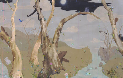
Untitled, 2002
Oil and acrylic on linen. 213 x 335cm
Camden Arts Centre
November 2006


This was my first visit to this gallery and I surprised myself by enjoying the exhibition immensely. It featured finished work from the last ten years and an interesting room full of studies. Even when she does work from photographs for some pieces the image is always built up through a succession of drawings and small paintings and then a full sized cartoon prior to the start of the painting.


This large untitled piece seems to be constructed along the principals of the golden section and probably owes something to oriental paintings for the illusion of depth. It clearly draws inspiration from gestural Chinese brush paintings for some subject content but is firmly located within her own practice and style.


A landscape populated with strange trees, animals, birds, insects and flowers. Despite all the characters, the space looks surprisingly empty. Depth is suggested by the two larger animals, the monkey and the bear, being half obscured by the trunks of the trees that dominate the space. The gazes between the animals, serve to lead the viewers eye through the composition. The sky is mainly cloudy daylight, but part of it is a moonlit night. An owl perches on one of the trees, silhouetted by the night time portion of sky. In the foreground are strewn a few playing cards that hint at a human absence.

The support is dark linen and she works from dark to light rather than the other way around. With the exception of the oil painted flowers in the foreground, her palette is one of soft understated pastel colours. When I first saw the work I thought that the tree trunks had been painted by floating oil paint onto another prepared surface covered with water. After this had dried, the trees had then been cut out and stuck on. Only by further research did I establish that the thickness was a gradual build up of gesso on the support itself! The process description that follows comes from a Russel Ferguson article in Parkett magazine[1].

· Blocks out the silhouettes of the smaller trees and branches with masking tape.

· Paints the monkey in dark water based ink on wet canvas to blur the edges and masks it.

· Thin acrylic washes green and brown earth, blue and white for the sky, rabbits, bear and squirrel also in acrylic. Leaves to dry and covers with a clear matt medium.

· The bigger trees are then painted using paper cut outs as a template, by building up 20 layers of gesso, sanded down between each layer and then the rest of the canvas is masked out. The trees are painted using household paint in about ten different colours, thinned with Floetrol.

· Then switching to oil paint the rest of the painting is added the final spontaneous addition being the hand of cards "to hold the foreground, when it seemed that everything had become too equalised, too much in harmony"

Whilst the painting is more saccharine fantasy than a site of melancholia, her willingness to experiment with the painting process without irony provides a useful contrast to the landscape paintings of other artists I have chosen.


[1] Ferguson Russel Laura Owens Paints a Picture pp58-62 Parkett #65 2002


©blackdog 2009

Tuesday, 24 March 2009

Gerhard Richter

Woman with Umbrella, 1964
Oil on Canvas 160 x 95cm
Hayward Gallery
14 October 2007

From the exhibition of The Painting of Modern Life this is one of the first images you encounter on entering and sets the scene perfectly for this contemporary exploration of Baudelaire’s ideas.

The title (Frau mit Schirm) is deliberately banal and seems to objectify what at first seems a strange painting compositionally. The right hand two thirds of the canvas are occupied with a blurry painting of a woman holding an umbrella in her left hand. She has brought her right hand to her mouth and could be stifling a yawn or stopping herself from crying out. The other third is a vertical stripe of cream down the left hand side, signalling perhaps that this is not so much a painting from a photograph, but a painting of a photograph.


However, rather than paint the photograph actual size as he has chosen to enlarge the image to life size, letting us stand back to contemplate the subject. The woman’s feet are cropped at the ankle, reinforcing the use of a photographic source. The image is blurred simulating either camera shake or perhaps the poor quality of the printed image of a photograph taken in the rain.

It seems to have an aura of sadness, but perhaps it is only once you know it is painted from a newspaper photograph of the grieving widow, Jacqueline Kennedy, the full weight of melancholy becomes apparent. Interesting that like Warhol, who must be a big influence, he has chosen to paint an image of the young widow taken sometime after the shooting (she wore the pink suit throughout the day despite it being covered in blood), rather than the president as he was killed. This certainly avoids being too controversial, but it also communicates the grief and evokes sympathy, rather than the disbelief and shock of the news footage. It also avoids the iconic look of the Warhol images, which trace the events surrounding the assassination and assumed the stature of history paintings.

Richter’s colour scheme, (which might be his own if the original is B&W – image isn’t in Atlas so I am unable to verify this) is a dark background with pale lemon yellows and greys with a few flecks of pink for the woman’s coat. Whilst this enhances the melancholic feeling of the image, the process is more about trying to remake a photograph rather than invest it with something new. The wet paint has either been dragged left to right across the image with a stiff bristle brush or perhaps a squeegee or repeatedly feathered with a soft brush. The surface is relatively smooth suggesting a fairly oil rich medium and has a certain slickness to it.


Although the painting has the look of the stills from the film of the presidential motorcade taken earlier in the day, the image is static and the emotion felt is different. Rather than the global loss of the president, we experience the personal grief of the widow. It recalls a moment in history that touched everybody at the time and I think, as a painting, its melancholy aura grows stronger with time as the shock value of using the image lessens.

©blackdog 2009

Sunday, 22 March 2009

Glenn Brown

Nausea, 2008
Oil on Panel 155 x 120 cm
Tate Liverpool
17 March 2009


It is always strange visiting a gallery for the first time because the environment has to be absorbed as well as the work. This was no exception and I was lucky to be able to spend a few hours with the paintings, most of the time as the only visitor in a particular room. The show is impressive and the way the work was hung brought out some interesting relationships and conversations between them. Particularly impressive were room 3 with five paintings based on a piece by Frank Auerbach and room 7 with three paintings of tragicomic, anthropomorphic blobs, namely The Hinterland 2006, Seventeen Seconds 2005 and International Velvet 2004.

Whilst there were many paintings I could have selected on the basis of technique, composition or colour, I have chosen one that sums up the entire show in just the title, Nausea. Looking at Brown’s paintings en masse or indeed too closely, nausea is the sensation I feel. In fact nausea is not a sickness, but rather a symptom of other conditions which may not be related to the stomach but trigger the response.


Interestingly, nausea is often indicative of an underlying condition of melancholia and it is well known that Jean Paul Sartre novel Nausea was originally called Melencholia, but the editor changed it. In Sartre’s existentialist novel, the protagonist, Roquentin, suffers from ennui and has random and unexpected bouts of nausea which he finally gets used to and deals with as he becomes aware that there isn’t any Meaning to life, just pure existence.

Brown’s starting point is the same source that Francis Bacon used for Head VI; a reproduction of Velázquez’s portrait of "Pope Innocent X". He then not only distorts the image by rotating it 180 degrees, in the manner of Georg Baselitz, but crops the head, adds the border from the printed page or postcard as an integral part of the painting and a flat pink circular “moon”. This is the first direct reference to the printed source of Brown’s images, and utilises the early strategies employed by Gerhard Richter to destroy the illusion of his photorealism by cropping the source so that the white margins (and sometimes text) were visible, whilst portions of the image were lost. The pink spot may be a reference to Sigmar Polke paintings of the same era.


Add to these knowing, but appropriate references, Brown’s swirling painted ‘brush marks’ and the livid colour scheme, and the result is an image of death and decay. The painting coldly asserts, through the motif of the distorted pontiff, that there isn’t a Spiritual Essence in the Universe. All we have is the despair at the pointlessness of one’s own existence, and if one uses the analogy of looking too long or too closely, for thinking too hard or too rationally, sensations of disgust and nausea. It is hard to summarise it better than Bataille’s 1958 review of Satre’s literary work “the entire novelistic work of Sartre seems haunted by an obsession with a rotten decomposed mouldy world one full of sickening secretions” [1]. The same could be said for Brown’s obsessions in his paintings.

[1] Menninghaus, Winfried Disgust: the theory and history of a strong sensation SUNY Press 2003 p356

©blackdog 2009

Friday, 20 March 2009

Georg Baselitz

Marcel and Maurizio are kind of similar, one might assume, the pharmacy flies higher, 2009
Oil on Canvas 300 x 250cm

White Cube, London
18 March 2009


This large impressive exhibition of new work, titled ‘Mrs Lenin and the Nightingale’ and curated by Sir Norman Rosenthal, is totally suited to the austere White Cube environment. It comprises 16 paintings, all of the same subject; a fictional image of Stalin and Lenin, seated and posed like Otto Dix’s 1924 portrait of his own parents, only in true Baselitz fashion, they are tipped upside down. Eight of the paintings are on a white background and eight on a black background and are hung alternatively in the two gallery spaces. Night follows day. Each of the black paintings has a large white border at the bottom, turning the painted area into a square, which is perhaps a modernist acknowledgement of the actual process of making the painting.

Curiously the name of each painting has a reference to contemporary artists and I couldn’t fathom the reasoning behind this seemingly arbitrary allocation. Perhaps it is a collective reference to the freedom today’s artists enjoy compared to his own environment in the GDR where he was asked to leave art school in East Berlin because of “political immaturity”.


Predictably, I have chosen one of the black paintings and like the other seven the ground colour of thin matt black is applied with unevenly with a wide brush. The two figures are rendered over the top in milky white, opaque lemon yellows and greys. Finally there is a layer of drawn marks and splatters and dribbles in dark black, grey and pure white. Although the motif is the same in each painting the interpretation in each is different, and although I realise the upside down image is to remind us it is just a painting, in this one the two men seem to be floating in space. Through careful drawing in the mayhem of marks, particular attention is given to the boots, which is a reference to Edvard Munch and the exposed erect penises, a reference perhaps to his own 1962 painting “A Big Night Down the Drain”.

Baselitz was born in 1938 in the village of Deutschbaselitz in Saxony, grew up in the GDR and fifty years later is still addressing the trauma of living as an artist in a country languishing in political repression and economic stagnation. The sixteen paintings allude to the fifteen states of the former Soviet Union created by Lenin and later ruled with unprecedented brutality by Stalin (known as ‘the Nightingale’ because he had been a chorister as a boy) with the series being completed by the former German Democratic Republic. His obsession with the past is palpable, as is the sense of loss signalled by the references to Dix in particular, but also all the other contemporary artists.


©blackdog 2009

Thursday, 19 March 2009

Alex Katz

Purple Wind, 1995
Oil on Canvas 90 x 66 inches

Not Seen

I have only seen this painting in photographic reproduction, which isn’t ideal for such a large work. What is worse is that I missed the chance to see it in Dublin in 2007 at an exhibition of Katz’s work at the Irish Museum of Modern Art and so far I have been unable to establish where the painting is now. I presume it is in private hands.

However, I have seen many of Katz’s paintings and although these were mainly his conversation pieces I can appreciate that his work is much more painterly than it appears in reproduction. The other thing I noticed, and I am sure applies to this piece, is the economy with which he paints. In other words, he lets the qualities of the brushwork and paint work to describe the content. You stand too close and all you see is paint, but when you stand back, the marks resolve into the image. In his landscapes and cityscapes, particularly those with trees, this is done with the simplest of touches. His technique of using the properties of the medium, reminds me more of Chinese brush painting than minimal abstraction of his “people paintings”.


The construction of the painting is easy to determine, but requires an experienced hand to execute with confidence on this scale. The ground colour is a flat purple and then rectangles of paint for the lit windows are painted wet into wet with single brush strokes of thin White with a little Naples Yellow. A black line is than drawn across each rectangle to represent the window frame and then used with a larger brush for the branches of a tree. Finally white highlights are added to the branches and dabs of white applied to the windows suggesting the interior lighting. We know it is just paint, yet as Merlin James notes in his commentary on the painting in the 25 year of Katz’s work, “there is a compelling illusion of space and presence behind the windows, and the image transcends the merely diagrammatic”.[1]

The painting is large and probably sized to mimic the windows in the apartment block opposite, exploring the idea of a painting as a window that we look through onto another world. It is night time, and Katz invites us to join him as voyeurs, overlooking the lives of the occupants in the manner of the Hitchcock film “Rear Window”. The tree silhouetted against the darkness beyond helps create a sense of distance between where we stand and the observed building. The looseness with which the branches are painted helps convey the sense of their movement in the wind. As we stand and look across the divide, our isolation becomes apparent; there is no one to be seen, and no matter how long we look, we will remain alone.

[1] James, Merlin Alex Katz, 25 Years of Painting, The Pole Green Press 1997.


©blackdog 2009

Wednesday, 18 March 2009

Henri Matisse

The Piano Lesson, 1916
Oil on canvas 245 x 212cm

MoMA, New York
21st November 1999


This was my first visit to MoMA and I saw so many ‘great’ paintings for the first time that I find it difficult to even remember them all. However, two paintings made such an impression that I will not forget the experience. One was Les Demoiselles D'Avignon by Picasso and the other was this painting by Magritte.

I remember being really surprised just how thin the paint was, Matisse uses a very loose scumbling of opaque paint over the canvas allowing the scrubby brush marks to be clearly seen. The result is a very lively surface although the hues are unmixed. Instead he gives striking contrasts between these rhythmically arranged flat planes of colour, that suggest an experimentation with the ideas of cubism. The colour scheme is predominantly sombre greys which combined with the sketchy brush work give the painting an ethereal melancholic air.


The painting is of Matisse's son having a piano lesson who gazes at the viewer with one eye, the other is obscured with paint. There is a woman, who might be his teacher watching him from behind. There is a balcony on the open window on the left that looks out onto a triangle of grass, and its wrought iron work echoes the music stand on the piano.

Although it was painted in 1916 it is Matisse’s memory of a time 6 years earlier when his son (who was called up to fight in the First World War in 1916) was made to play the piano. The 'piano teacher' is actually a figure in a painting which hangs on the wall by the window. It is a schematic rendition of Matisse's Woman on a High Stool that must have been in the appartment, and he has also painted one of his bronze sculptures in the lower left-hand foreground. This combination of his own works of art with the image of the memory of his own son playing music make an intensely personal and moving painting.

©blackdog 2009

Tuesday, 17 March 2009

Edvard Munch

Self Portrait with Cigarette, 1895
Oil on Canvas 110 x 86 cm

Royal Academy, London
22 October 2005


I had been looking forward to this exhibition, titled Munch by Himself, at the Royal Academy, for a long time and I wasn't disappointed. Given Munch’s melancholic disposition many of the works were of great interest to me, but rather than pick one of the more iconic pieces I decided to choose this wonderful self-portrait to analyse.


It was the first major piece of his that was bought by the National Gallery in Norway and consequently, was a significant breakthrough for him.

The pose is inspired by a painting he had seen by his teacher, Christian Krohg, of the Norwegian painter Gerhard Munthe in a restaurant, and a photograph of August Strindberg in top hat that is lit from below. Unlike these images the Munch self-portrait denies any surroundings except darkness. I think this painting must have also been an influence on Max Beckmann for the self portrait with cigarette that he completed in 1927.


The paint is so thin everywhere apart from the face and hands except for one or two deep shadows that these jump out at us from the gloom. Because the face and hands are lit from below he has the appearance of an actor on the stage meeting our gaze eye to eye. There are lots of swirling brushstrokes in long strokes of blue and red violet that create a very turbulent surface. This loose brushwork results in the jacket fading in and out of the ground and dribbles and runs of paint are visible at the bottom of the canvas. He seems near and yet distant due to the partial cloaking of the figure in paint.

A wisp of smoke rises from the cigarette that can be read as a metaphor for death. This also creates a distance from the viewer despite the eye contact, suggesting that we might have surprised him or caught him daydreaming? Munch has placed the figure slightly off centre to the left hand side with the head touching the top of the canvas, and I get a sense of a self assured, but lonely man.

I have since read that he painted the self-portrait as a companion to a portrait of a lover, Dagny, who came from a respectable Norwegian family. Munch created an outrage by pairing the portraits together despite the fact that, after affairs with both Munch and Strindberg, Dagny was married to a Polish writer Stanislaw Przybyszewski!


(Dagny's own end was grim. For several years, she lived in alcoholic poverty with Przybyszewski, by whom she had two children. Then in 1901, a Polish admirer of hers gave a banquet at which the guests found the host dead in an adjoining room, having committed suicide out of love for her. He left his pistol to another Pole, called X, who loved her to distraction. He invited her to the Grand Hotel, Tbilisi, where he shot first her, then himself. He did it, he wrote in a letter to her young son, because she was "not of this world… she was the incarnation of goodness… she was God"[1])

[1] Prideuax, Sue Edvard Munch: Behind the Scream,Yale University Press, 2005 p205


©blackdog 2009

Monday, 16 March 2009

Gustav Courbet

L'Homme Blessé 1844-54
Oil on Canvas, 81 x 97 cm

National Portrait Gallery, London
11 November 2005

This painting was in a large-scale exhibition at the National Portrait Gallery, covering artists’ own images from between the Renaissance to the contemporary period within the tradition of western painting. It was very interesting exhibition, well hung and mercifully, late on Friday evening, really quiet.

One of the self-portraits that really caught my eye was this painting by Courbet that I hadn’t seen before. It is quite unusual in that the image we see of a man (Courbet) leaning against the base of a tree, with blood streaming down his shirt from a wound, exactly covers a painting of the same man with a woman in his arms resting her head on his left shoulder[1].


The painting is life sized and we seem to confront the protagonist by looking up from below his waist that has been truncated by the edge of the canvas. The perspective invites us to believe that the lower half of his body intrudes into the gallery space. The brushwork on the face and right hand is blended and smooth whilst the brushwork on the cloak and background is loose and sketchy. This difference in treatment and tone brings them forwards. His eyes are almost closed, perhaps the final glimmer as life ebbs away, and I feel he is just about to lose consciousness and slip off the base of the canvas.

The painting has been known as “The Duel” and a duellist’s sword can be seen above the right shoulder. Michael Fried in his book called Courbet’s Realism makes much of this discarded sword as being analogous to the painter’s brush, the right hand gripping the cloak in place of the palette and the blood on the shirt analogous to paint on canvas. His point is that Courbet is going beyond simple representation and by extending the figure into our space and by internalising the gaze (eyes almost closed) he is trying to embody himself in the image[2].

For me the most interesting aspect remains the macabre transformation of the lovers’ bliss into a death scene. This is probably accounted for by his mistress (Justine) leaving him in 1854 and marrying another man, and Courbet tellingly never assigned the date of the re-painting (1854) to the picture when it was exhibited in 1855, but left it dated 1844. Until the advent of x-rays this would have been the only clue to the true melancholic nature of the painting depicting a lover whose heart was fatally wounded.

[1] Bowness, Alan Gustave Courbet Catalogue, Lund Humphries, London. 1977 p109

[2] Fried, Michael Courbets’ Realism, University of Chicago Press 1992 p80

©blackdog 2009

Thursday, 12 March 2009

Otto Dix

The Dancer Anita Berber 1925
Tempera on Plywood, 120 x 65 cm

Galerie der Stadt, Stuttgart
Not Seen


The only painting by Otto Dix that I have seen is The Portrait of the Journalist Sylvia von Harden, that is in the Pomidou Centre in Paris. Whilst this is painted in similar colours and materials to The Dancer Anita Berber, it lacks the latter’s air of melancholy. So I will work from a quality photographic reproduction and revise the review once I have had chance to see the painting first hand.

I find his model a fascinating subject, a tragic star whose flame burned brightly and was destined to die young. She was born in Dresden and moved to Berlin to be a cabaret dancer when she was just 16 years old. Three years later she was dancing in nude reviews and appearing in pornographic films. Dix met Berber in the 1925, by which time she was a cocaine addict and allegedly drank a bottle of cognac a night. He portrayed her as the notorious vamp, loved by her public for her gaudy costumes and ambiguous sexuality. She was diagnosed with tuberculosis three years later and died in 1929.


Dix worked by making a detailed drawing of the model from life and then applied the first coat of paint with the model present. After this he worked without her present, building up the image from layers of transparent paint, maintaining the physicality from the sharply observed and drawn contours of the sheath like dress. The use of egg tempera on panel comes from Dix’s interest in the paintings of Grunewald and Cranach and gives the material a glowing translucent quality.

The most striking aspect of the painting though is not the choice of materials, but the widespread use of red. The effect of clothing her in red, giving her red hair, red lipstick and then extending the colour out into the background means that the image radiates with an almost unbearable intensity. There is an under painting of yellow that gives warmth to some of the red tones, but elsewhere he has added blues to give colder shades that border on magenta. Her face looks emaciated, with sunken cheeks and eyes deep in their sockets, and this blue seems to have slipped into the complexion, giving an impression of illness and decay. The body on the other hand, with the folds of the dress gathered on the hip, looks supple and agile. Her snakelike pose flaunts sexuality but retains an air of aloofness. Look but do not touch.

The ethereal face, with Berber’s trademark heart shaped lipstick, hovering between ghost and caricature is at complete variance with the body. Marked by her addictions it conflicts with the postural message and conveys an expression of forlorn desperation rather than that of the flirtatious flamboyant vamp.

©blackdog 2009

Wednesday, 11 March 2009

Gary Hume

Incubus 1996
Alkyd House Paint on Formica, 239x 385 cm

Modern Art, Oxford
24 August 2008


Gary Hume has been making paintings of doors for over twenty years and this is the first exhibition to survey this body of work. There were eighteen Door Paintings spanning the twenty years and seeing them together in the space was a totally different experience than seeing them hung with other work. Personally I thought they lost some of their impact, perhaps because they reflect the environment they are in and when that is just more monochrome Door Paintings, some of the richness is lost.


The painting I have chosen is 'Incubus' as it is one that I have also seen in another gallery, Tate Modern allowing a comparison of the sensation of seeing it in the different environments. Like all of the paintings it is based on institutional swing doors found in schools and hospitals. It is painted in two tones of pink household gloss to give a literal connection with the real thing and the layers of paint are built up over a period of time to give a slight relief to the lighter coloured panels. It is life size and there are drips and runs, just as there would be if he was painting actual doors rather than a facsimile of doors.

Conceptually they are modernist paintings that are, as the critic Adrian Searle noted in Frieze magazine in 1993[1], “a doorway to theory heaven”, positioned halfway between old-fashioned artworks and conceptual ready-mades, offering a wealth of “readings”: metaphorical, social and art historical. Instead of painting as a window on another world we have painting as a closed institutional door!

Whilst I can understand the theoretical excitement about the concept, I empathise most with what they represent to me and that is the feelings that are tapped into through their association with hospitals. Certainly, presented as a single work, rather than exhibited with other variations on the theme, I was better able to appreciate the quite melancholy beauty of the painting and lose myself in its reflective surface. Clearly they have many metaphorical meanings – and these will be different for each viewer, they could be symbolic of the failing NHS or the doors you pass through on the way to give birth; for me it is a much darker set of associations.


[1] Searle, Adrian Shut That Door Frieze #11, July/August 1993

©blackdog 2009

Tuesday, 10 March 2009

Ernst Ludwig Kirchner

Self Portrait as a Soldier 1915
Oil on canvas, 69 x 61 cm

Royal Academy, London
June 2003


The show focused on his work between 1908 and 1918 and concentrated in particular on his depiction of street scenes in Berlin and how he used these as a mirror of human psychology. Although some of these works are more melancholic than celebratory I have chosen the last painting in the exhibition and the one that made the biggest impact on me.


In 1915 Kirchner volunteered for the army as an artilleryman in order to avoid being drafted as an infantryman in the trenches, but his deepening personal crisis led to a physical and psychological breakdown. It was while he was recuperating at a Swiss sanatorium that he painted this haunting graphic self portrait.

Thin and gaunt, he stares out of the canvas with an unfocussed gaze, cigarette dangling from his lips and the bloodied gangrenous stump of his painting hand, raised for all to see.

The paint is applied evenly with powerful expressive brushstrokes that are short cross hatching and look very rapid in their execution. His flesh tones are a sickly yellow and outlined in black. The greens in the background contrast and emphasise the strength and variety of vivid reds.

The space in the painting is very claustrophobic, accentuated by the sharp converging diagonals, but it is his imaginary amputation that is the most striking metaphor for loss. He is clearly expressing his concern for his creativity, artistic vision, and inspiration, and perhaps even his ability to paint. The nude woman in the background seems to refer to his pre-war work and is perhaps an additional metaphor representing something that is now “behind him” or perhaps specifically the loss of his potency and manhood.


Fittingly it was the final painting in the exhibition, as although he continued to work after 1915, his painting, perhaps understandably, lacked the expressive resonance of his images of pre-war life in Berlin.

©blackdog 2009

Sunday, 8 March 2009

Nigel Cooke

To Work Is To Play 2008
Oil on Canvas 220 x 370 x 7cm

Modern Art, London
24 May 2008


The title of the show is "New Accursed Art Club" and is clearly about ‘old school’ artists being a dead cliché, a theme that is explored in various ways in the work. The word that comes to my mind when confronted with these large imposing paintings is bathos, the way one finds an incongruous mixture high and low culture. This is usually associated with poetry, but I think applicable to this use of large skilfully painted statements to depict caricactures.


Cooke uses his undoubted technical skill to depict everything that is coarse and base in the urban landscape. Of course there are the usual clichés of copulating and defecating dogs, but what is worse in Cooke’s world is that even the fairies wear baseball caps and CK underpants! In a way this exposé of the revered artists reminds me of the parodies of William Hogarth.

He uses very deep metal stretchers for these large canvases, and the canvas is very fine and no evidence of the weave is visible on the surface. The edges are pristine white and have been expertly masked; very crisp.

I would guess that for the background, thin paint has been run down the surface and I wonder if the paint is brushed or sprayed? The fuzziness of the edges, the scumbling of the paint on the mottled ground, and the use bright colour against the greys of the background.

The detail below shows an instance of scarring in either the primer or in subsequent paint layers and perhaps provide evidence of reworking the images. They can be found throughout the surface and serve to break up and dispel the perfection of the build up of glazes. This build up of transparent layers is formidable, leaving thicker passages of pigment deep inside the surface, and I can well believe these large paintings take over a year to paint.


One would think that an artist obsessed with the "Death of Painting" couldn't fail to paint melancholic images, but I cannot say this was true for all the works in the show. I think this painting is a good example of where, for me, the bathos is too strong and the underlying melancholia becomes part of the joke.

©blackdog 2009

Thursday, 5 March 2009

Maria Lassnig

Du oder Ich, 2005
Oil on canvas 202 x 155cm

Serpentine Gallery, London
1st May 2008


This exhibition was quite a surprise for me as although I had seen her work published in magazines, the reproductions did little to convey the power of the large finished paintings. For over 60 years she has been making difficult, complex pictures that attempt to visualize the invisible aspects of her bodily sensations. She calls them “body-awareness” paintings. This naked self portrait of Lassnig is the painting that confronts you as you enter the show.


The life sized image is called Du oder Ich (You or Me), and she sits open legged open mouthed holding two guns, one pointed right at us, the other held in her left hand, at her own head. The eyes hold us with a reptilian unblinking stare and follow you if you try and edge away. One false move and whatever is killing her will kill us instead. Given that Lassnig painted this picture when she was 86, this defiant take on sex and death maybe implies that for her continued survival we have to go first.

The life-sized figure is centrally placed and floats on the large canvas. The fact that there is no background focuses our attention on the figure and ensures that we are not distracted from the introspective self examination. A blue-green shadow hovers around the torso and arms projecting the figure forwards. The rapidly executed brush work follows the form and the colours seem to be mixed on the canvas. I find the pastel palette quite nauseous and certainly contribute to the sense of unease I feel in front of the painting. There is something about the painting that reminds me of Egon Schiele that could be the pose or the large unpainted area around the figure.

Clearly she still feels that painting has something to say about the human condition, and many of her paintings have a humorous dimension, even when the sentiment is as bleak as this one! Perhaps for this reason she continues to work from the figure rather than use photographs, even persuading her neighbours to pose naked for her when she needs a model. The titles are well chosen and consistently added something to the image depicted. Excellent examples being “Adam and Eve in Underwear” catches the couple entangled on the floor, naked from the waist up, and “Madonna of the Pastries” with an ashen faced naked woman sitting behind a table of cakes. Consequently the viewer is engaged directly through the paintings’ physical presence and implied narratives of the subject reinforced by the titles.

©blackdog 2009

Wednesday, 4 March 2009

Gillian Carnegie

Untitled, 2003
Oil on Canvas 172 x 137cm

Tate Britain, London
22nd October 2005


Exhibiting at the Tate for the second time in 3 years this time as part of the Turner Prize shortlist. Whist I enjoyed her exhibition immensely, it was no surprise it didn’t win.

She works within traditional categories of painting - still life, landscape, the figure and portraiture - each with a different technique. I found this exhibition interesting on a number of levels. The hang itself was something I was very conscious of given the different categories of painting and the wide variety of scale. Although Carnegie works in series, returning to the same subject but varying her approach slightly each time, in all her shows I have seen she likes to exhibit a mix of subjects, styles and techniques together. I felt there was to many things going on and that her multiple 'voice' was further fragmented by the hang - I didn't get a sense of dialogue between the work.


I think all of her paintings have a melancholic air, but I was particularly taken with this large painting of two rather barren trees in what looks like an atrium or some other kind of public place. I don't know the source, but I assume it is from a photograph, as I have found no reference to her working in situ from life. The trees are off-centre to the right, balanced by the weight of shadow on the left-hand side and cropped severely by the edge and top of the canvas, suggesting photographic source material.

The colour is predominately two tones of an "apple" green for the background of light and shadow that are combined with dark browns and blacks on the trees. It is this choice of colour that gives me a sense of melancholy as I contemplate this inner sanctuary.

The paint is quite thin and the brushwork in the shadows on the wall reminded me of Munch - probably because I had just seen his work. The brushy strokes are sketchy but confident and most importantly, extremely effective the way she broadly scumbles one semi-transparent layer over another. Thicker paint is used for the trunk and branches of the trees but they are also painted with broad definite strokes. Creates a sense of space.

I general I found her work full of ideas for experimentation with paint and food for thought on the subject of tension between the materiality of the paint and what it depicts.

According to the critic Barry Schwabsky, writing in Artforum magazine: 'Carnegie turns back toward the fusty hues of old pictures rotting beneath their own varnish, not to reclaim some former solidity but all the better to verify her forms' ultimate evanescence.'


©blackdog 2009

Tuesday, 3 March 2009

Edouard Vuillard

Nape of Misai’s neck, 1897
Oil on board mounted on cradled panel, 13 x 33 in

Royal Academy, London
31st March 2004


This extensive show covered not only his paintings, but also featured his drawings and photographs. Although there were many paintings of gloomy interiors that betrayed his interest in the theatre of Ibsen and perhaps the influence of Edvard Munch, I preferred his intimate portrayals of his mother sewing, and her clients trying on their new dresses. These and the portraits of close friends record the melancholia inherent in the everyday and have a claustrophobic intensity that he shares with Pierre Bonnard. So rather than a bleak interior, the painting I have chosen is of Misia Nantanson, the wife of one of his clients, and for a time the object of his desire.


Misia Godebska, a Polish pianist and pupil of the composer Gabriel Fauré was attractive, intelligent and capricious and after her marriage to Thadée Nantanson, she gathered around her a group of bohemian admirers. There is little doubt that Vuillard fell under her spell; he helped her to decorate her apartment, went with her to exhibitions and in the 1890’s painted her more than any other person outside his family. The setting is the Nantanson’s country house in the summer and the pose suggests that the painter is watching his hostess engrossed in reading perhaps. Despite the small size and the simplicity of the restrained palette the loose matte brushwork in creams and yellows contrasting with the violet notes in the background, keeps the surface vibrant and suggest the torpor of a hot summer afternoon with little to do.

However, rather than ennui, you get a real sense of the voyeuristic presence of the artist, as his subject, with her face hidden behind a lock of hair, looks away leaving her neck exposed to his gaze. The sense of unfulfilled romance is palpable and it seems Vuillard was destined to “long after women” from a distance as he never married and lived with his mother until her death in 1920.

The extraordinary long rectangular shape of the painting reinforces the claustrophobic intimacy as the viewer looms above the vulnerable neck. The tight crop, although not the shape of the image reflects Vuillard’s use of photography as an aide memoir, he owned a Kodak and took thousands of photographs including several of Misia Nantanson that afforded him the luxury of extending his indulgence. However, the flatness of the image and the vulnerable neck as subject recalls Japanese prints, in particular Utamaro’s images of courtesans.


As Vuillard states in one of his journals: “The expressive techniques of painting are capable of conveying an analogy, but not an impossible photograph of, a moment. How different are the snapshot and the image.”[1]

No doubt he felt his painting was a better vehicle for conveying his true feelings than the photographs of her that often featured her husband, albeit out of focus.

[1] Easton, Elizabeth Wynne, The Intentional Snapshot Vuillard Catalogue National Museum of Art Washington 2003 p431

Monday, 2 March 2009

Gerhard Richter

I.G. 1993
Oil on Canvas 82 x 92cm

Compton Verney - Warwickshire
9 December 2007


One of three paintings of the naked back of his third wife, Isa Genken, this is #790-3 in his Catalogue Raisonné and is part of the contemporary art collection owned by the Fundacion ‘la Caixa’ in Barcelona.

In this life size painting I.G. is shown from the waist up, she has her head down and stands with her arms at her side. Perhaps she has her head against the wall, as the shadow seems very shallow around the head. The pose looks very abject, heightened by the large green/black void to the left of the figure and the choice of horizontal format. It is the simplest and most melancholic of the 3 paintings in the series.


Richter has produced many such ‘photo-paintings’, made using a multi-step process of representations. He starts with a photograph and projects it onto his canvas, where he traces its form. Taking his colour palette from the photograph, he paints to replicate the look of the original picture. The surface of the painting is very smooth, probably done by wiping the finished painting with a soft wet brush. Interesting that he leaves the flaws in the canvas surface. There are no sharp edges within the image so this soft focus becomes a blurring of the boundary between photographic representation and the painterly art. I should say that the colour reproduction in the photograph of the painting shows none of the subtlety of the painting, particularly in the background.

I am always intrigued by paintings of a person’s back. The denial of the identity raises so many questions. Is the person turned away because they don’t want to be seen, or is the artist affording the subject some privacy? Curiously page 416 in Atlas has four photographs of I.G. in the nude, none of which became paintings yet the photographs for three images he did choose to paint are not included.


Consequently I suspect Richter is making a statement about portraiture painting. Richter has remarked in a 1966 that “A portrait must not express anything of the sitter’s ‘soul’, essence or character…it is far better to paint a portrait from a photograph, because no one can ever paint a specific person – only a picture that has nothing in common with the sitter. In a portrait by me, the likeness to the model is apparent, unintentional and also entirely useless.”[1]


[1] Hans Ulrich Obrist (ed), Gerhard Richter. The Daily Practice of Painting. Writings and Interviews 1962-1993. London 1995 p57

©blackdog 2009