Friday, 27 February 2009

Francis Bacon

Head VI, 1949
Oil on canvas 93 x 76cm

Museum of Modern Art, Scotland
29th August 2005


A special pilgrimage to Edinburgh to see this exhibition of portraits and heads, many of which I had only seen in reproduction before and I wasn't disappointed.

The first room contained many outstanding paintings including two that I have long admired, but only seen before in reproduction. "Head VI" is owned by the Arts Council and is a forerunner of what were to become the popes - a working of Velázquez’s portrait of "Pope Innocent X". It is the first image to include a pope as subject and probably the first use of his space frame in a painting. He sits in this ‘Eichmann’ box, mouth receding like a tunnel, gilded chair described by a few drags of paint, the tassel/pull cord dangling in front of his face, eyes and top of head obscured by a curtain of paint dragged over the top.


The paint is applied very sparsely with lots of canvas showing. Paint thick and opaque, looks very chalky, like there is no oil in it at all! Canvas is not primed. A very simple palette of Episcopal purple mixed with white, a golden yellow for the throne, the darks for the curtains and some bluish greys in the mouth. The colour in this reproduction is a little redder than the painting.
It is well reported that despite the appeal of the Velázquez portrait, he didn’t see it in the original until 1990[1]. Astonishing really as the reproductions convey no hint of its freedom of handling, yet Bacon’s work is incredibly loose.

Taking this as his starting point, Bacon essentially grafted a very graphic photographic or filmic image onto the staid Baroque prototype. The specific source for the pope’s gaping, screaming mouth, shattered pince-nez glasses, and blood-dripping eye is a black and white still from Sergei Eisenstein’s classic 1925 film, Battleship Potemkin.


While Innocent X directly confronts his papal audience with a confident, almost contemptuous gaze, Bacon’s pope would seem oblivious to observation since preoccupied by pain. Attired in purple vestments the subject is trapped in his ‘box’ and jolted into involuntary motion by external forces or internal psychoses. His face is partly veiled by curtains, maybe to suggest he is in the confessional. The sense of power and control of Velázquez’s Innocent is replaced by the involuntary cry of Bacon’s anonymous occupant of the ‘hot seat’, and we can only speculate whether he is being tortured or is a tortured soul.

In making this devastating image of The Pontiff, God's representative on Earth, screaming in pain, he attacks the principals of hierarchical order and spiritual authority that the Pope embodies, suggesting that either God doesn't exist or he has abandoned us to our own devices. I find this transformation of the Spanish artist’s confident client and relaxed leader into a screaming victim contemplating the loss of God very melancholic indeed.

Bacon remains an inspiration as to what can be achieved with paint and I was pleased I made the effort, it was a real privilege to see these works, many of which are in private hands.


[1] Sylvester, David Looking Back at Francis Bacon, Thanes & Hudson, London 2000 p42


©blackdog 2009

Thursday, 26 February 2009

Karen Kilimnik

Mary Shelly Writing Frankenstein 2001
Water soluble oil colour on canvas, 20 x 16 inches


Serpentine Gallery, London
April 2007


I really didn’t like this exhibition at all and struggled to engage with the work. What really put me off was the way the Serpentine Gallery looked like it had been the victim of an episode of the Channel 4 reality show “Changing Rooms”. The idea was to recreate the orangery of an English Country House and she had painted the west gallery of the Serpentine apple green and furnishes it with garden seats and a few potted garden-centre shrubs with tied on oranges. The central rotunda was supposed to be a maze of ante chambers, and each was filled with useless decoration and had taped harpsichord music playing.

Clearly she is the kind of American who obsesses about the strangeness of European architecture and uses the stage sets as a way of “contextualising” her work. Frankly the paintings needed all the help they could get, because with few exceptions, they were as weak as her mise-en-scene at capturing the elegance of a lost time and culture.

The gallery handout listed here influences as George Stubbs, Edwin Landseer, Henry Raeburn, Thomas Gainsborough and Joshua Reynolds and whilst I can understand this from a subject point of view, it certainly didn’t apply to the painting which was loose and sloppy and the water-soluble oil paint just looked horrible. The handout talks about the “affective charge of Kilimnik's work, and how this has to do with the gap between the kind of paintings she looks at so intently, and the kind of painting she actually achieves”; personally I couldn’t see it.


The painting I have chosen purports to be Mary Wollstonecraft Shelly writing Frankenstein. The idea is wonderfully melancholic, as this novel could be said to be the beginning of two strands of popular culture; horror and science fiction.

A young girl wearing a low cut blouse with a red shawl or jacket looks wistfully off to the right. She certainly looks like a damsel from a B movie adaptation of the novel and behind her “Hollywood style” lightning forks illuminate cold, blue mountains. As the portrait looks nothing like Richard Rothwell's portrait of Mary Shelley, it is presumably painted from a photograph of a celebrity(?) stand-in that she has cast in the role. It is perhaps a visualisation of the imagination and fantasy inside an American teenage girl’s mind who views all things European as romantic.


I can only think that I am the wrong sex, the wrong age and the wrong cultural background to understand the work and could only feel that the potential was there, but the execution was disappointing. The really sad thing is that the Rothwell portrait does actually look melancholic!

©blackdog 2009

Wednesday, 25 February 2009

Michael van Ofen


Untitled 2005
Oil on Canvas 50 x 43cm

Alison Jacques Gallery, London
11 November 2006


A small but interesting exhibition of work by the German artist Michael van Ofen was held in the old Alison Jacques Gallery behind the Royal Academy. The gallery is just like a private house, but with the walls painted white and now furniture. I mention this as it was the perfect space for these small quiet unassuming paintings.


I was extremely interested in his work as I felt they definitely had a melancholic aura and that this was very closely related to the stripping down of the subjects to a structure of brushstrokes. The viewer’s perception hovers simultaneously between an awareness of the elements of the construction and their perception as allusive representation. In other words we accept the image as painted, but are aware of something intangible that is lost.

Frequently using Nineteenth century paintings as a basis for his work, Michael van Ofen deconstructs historical paintings into their painterly elements and then reassembles them. Many of his works are untitled and the one I have chosen is no exception. We see a man in a dark cloak and a white turban against a pale blue sky. To me it suggests a fragment of a painting by Gerome, but that may be very wide of the mark. This portrait is captured in only a handful of large fluid brushstrokes and yet the simplicity of this beautifully economical painting is deceptive. The gallery handout informs us that he will remove all paint from the canvas and rebuild the surface many times in the process of completing a work, rehearsing the work over and over again striving for the perfect weight, colour and speed of mark. The way the orange tunic resonates with the blue of the sky is a case in point.

The paintings are all small and this scaling down of the image from the original is synonymous with the loss of information in the transition. It is this loss of detail whilst retaining an aesthetically appealing image which is at the heart of the inherent sadness in the paintings.

©blackdog 2009
Tuesday, 24 February 2009

Johannes Kahrs

Man putting his Finger in his Fingers 2004
Oil on Canvas 240 x 250 cm

Parasol Unit, London
Decenber 2006


This was another excellent exhibition of paintings and drawings at the Parasol Unit in London. The title of the show was “Lonely long meaningless way home” and was the first solo exhibition of Johannes Kahrs work in the UK. The title is a quote from Franz Kafka, and comprised a series of paintings together with pastel and charcoal works on paper, both of which media are of equal significance to him.

Perhaps most surprising is that both the paintings and the drawings are presented behind reflecting glass. This is something that Francis Bacon used to insist upon with his work and it has the effect of not only distancing the viewer from the work, but also superimposing your own reflection by on the surface. Integrating and implicating you the subject matter.


As you might expect from the title of the show, many of the works had a melancholic aspect to them. However, I have selected this large painting as it depicts a life size man in dark clothes lying down. It was shown on its own in a side room to the main galleries and had a very powerful presence. Despite the minimal shadow cast on the “floor” from the figure, I had a sense of it being well “grounded” rather than floating and the weight of the dark grey background above the figure pressing down on his chest. His face and hands are bathed in red paint and knowing Kahrs fondness for taking his imagery from film stills, I assumed it depicted blood. Reading the catalogue later, I find that Kahrs maintains that the face is just red from “basking in the sun”[1]. I haven’t been able to locate the source image, but still have my suspicions that it comes from Tarantino’s film “Reservoir Dogs” and that the red paint is an allusion to fake movie blood.

Although the glass made it difficult to ascertain his painting process, I would say that he started with the dark ground and then worked forwards using opaque paint. The paint is on the figure is quite thick and has been blended that gives a softness to the features. This may be mimicking and referencing the source material for his image, which may have been taken from a television screen, but also means that the brush work of the artist is suppressed.

The title gives us an insight into another of Kahrs obsessions, that of hands. Many of the images depicted hands prominently, and in some it was the subject. The gesture of one finger of one hand placed in the fingers of the other can be read as metaphor for sexual intercourse. The man’s eyes are closed and if he is just sleeping rather than a corpse, perhaps his hands betray his thoughts. The image is hard to fathom, but one interpretation could be that his thoughts are of an impossible love, one that can never be reached and consequently merge with sadness and that he is taking refuge from life by pretending to be asleep. This withdrawal into a disconsolate state of “temporary death” is a classic symptom of a melancholic. This reading would certainly fit with the Kafka story of a man who finds love, but quickly looses it again. But then just like my reflection in the glass keeping me at a distance from the painting, I am superimposing my own narrative on the work.


[1] de Weck Ardalan, Ziba Recurring Disillusionment Lonely long meaningless way home: Johannes Kahrs jrp Ringier 2006 p48

©blackdog 2009

Monday, 23 February 2009

Dexter Dalwood

Ceauşescu's Execution, 2002
Oil on Canvas 268 x 347 cm

Tate Britain, London
26th February 2003


This was the first Dexter Dalwood painting I had seen and its dramatic size and bold colours gave it a lot of presence. I loved the contrast in the brushwork between thick slathers of paint in the background and the thin blended surface in the foreground. The specks of broken glass and shards of wood give depth and imply by association the event implied in the title of the painting.


I was intrigued by how successfully the painting conjured up memories of the downfall of a regime whose palaces were filled with priceless silk, porcelain, marble, silverware, and of course chandeliers, by such non-specific content.

His earlier pieces are predominantly imagined interiors of the homes of historical and contemporary figures. For example, Dalwood's painting Kurt Cobain's Greenhouse imagines the private home in Seattle where the eponymous rock singer committed suicide in 1994. These “portraits” are achieved through association with the person’s artifacts and by allusion to the time by appropriating art of the period. This work came from his desire to depict places that one had heard of but hadn't necessarily got a picture for in your head.

His painting of Ceauşescu's Execution extends that recreation of time and space to summon forth the atmosphere and implications of a historical event and marks a development of both his ideas and technique. The result is a post-modern version of the traditional history painting and I enjoyed the challenge involved in unpicking his work.

The starting point for the painting is the size; this is exactly the same dimensions as Francisco Goya’s historical painting Third May 1808 which depicts the execution by firing squad of a group of Spanish patriots by Napoleon’s Imperial Guard. The Ceauşescus were also executed by a firing squad consisting of elite paratroop regiment soldiers who shot them with AK-47 assault rifles. At first I thought this was also the source for the triangle of table top in the foreground, as there is an area of illuminated foreground in Goya’s masterpiece, but the shape is identical to the foreground in Caspar David Friedrich’s Der Mönch Am Meer. The effect of the light under the gloom above is similar to bleakness and desolation invoked by Friedrich’s painting. Given that the splinters on the table top resemble the shards of ice in another Friedrich painting The Sea of Ice, I think the later interpretation is more likely. The hard part was the background which I thought looked like the work of Abstract Expressionist Franz Kline, yet I could see no connection with the title or the late 1980’s. Fortunately the exhibition catalogue[1] came to the rescue and the source for the “curtains” dripping with blood is a painting by Georg Baselitz titled Der Krug which was completed only months before the execution of the Ceauşescus was broadcast on television


I have since become a real fan of his work and have seen both earlier pieces at Saatchi’s Gallery in London and been to the opening night of a recent large exhibition of new paintings at the Gagosian Gallery in London. However, nothing has come close to the impact of seeing this painting for the first time and I thought it was one of the best pieces in the Triennial exhibition.

[1] Tufnel, Ben Days Like These Catalogue Tate Publishing 2003 pp64-69

©blackdog 2009

Friday, 20 February 2009

Claire Harvey

Cyclops 2005
Oil on Canvas 35 x 40 cm

Frieze Art Fair
21 October 2005


I have only seen this artists work twice, once at the Frieze Art Fair in London and then a small exhibition of her work in the members room at Tate Modern. There were three small paintings at Frieze on the Fons Walters stand (her gallery in Amsterdam). The work in Tate Modern was even smaller consisted of hundreds of delicate miniscule images that looked like ink or oil on “Scotch” tape.

I found her work interesting for the unusual supports that she uses, that make the paintings and drawings seem almost disposable. She has also worked on transparencies, glass slides, and Post-It notes. All featuring lone figures engaged in solitary pursuits.


I have picked a painting from the paintings on show at Frieze that is typical of her work. It shows a solitary man with a small rucksack looking into a plate glass window. The man holds his hand to the side of his head to shield his eyes from the glare and like the figures in most of her work, we cannot see the face, only the reflection of his body. This gesture keeps us guessing at the identity of the protagonist whilst at the same time the small size of the figure draws us into an intimate relationship with the image. It is a private moment that we are witness to, one we have all experienced.

Her work reminds me of the paintings of Luc Tuymans, not just because of the chalky paint, but also the ambiguity of the images and the way a grouping of a number of small works together strengthens and reinforces the isolation within each image.

The title references the one eyed giants of Greek Mythology, but the narrative possibilities remain very open. It could be about desire and longing for the unobtainable items that he cannot see within the shop display or it could just be about curiosity. In a moment he will turn away and walk on, and this transience of everyday actions is also a recurring feature in her work which together with the isolation creates an atmosphere of alienation. The emptiness of the scene speaks of the emotional disposition of a melancholic, who according to Walter Benjamin thinks of the desolate “emptied world so as to take pleasure in its sight”.[1]

[1] Benjamin, Walter The Origin of German Tragic Drama, NLB London 1977 Trans John Osbourne p318

©blackdog 2009

Thursday, 19 February 2009

Chantal Joffe
Jeremy, 2008
Oil on board 40 x 32cm

Victoria Miro, London
3rd July 2008


In addition to the large pieces exhibited at this show of her work there were a number of smaller pieces on a variety of supports. This piece is painted onto a thin sheet (6mm) of 7 ply birch plywood. The painting wall unframed and mounted off the wall probably with a block glued to the back.

As most of her paintings are expressive studies of women, this intimate, smaller than life size, portrait of a male friend, caught my eye. It is an excellent example of how her composition and fluid paint handling contribute to imposing/revealing an emotional expression to her portraits based on photographs (although she has been experimenting working from life).


The gaze is off to the right and isn’t particularly introspective or dejected, but there is something about the distorted facial features, particularly the deep shadows under the eyes that gives the piece a melancholic air. Perhaps the long face and full, sensitive lips evoke the personality of a dandy.

The surface of the panel has not been prepared in anyway as both wood grain and loose wood fibre can be seen through the finished piece. The panel has been primed with a single layer of pink paint, which can be seen clearly, as no attempt has been made to protect the edge of the plywood. It looks as if there is an underpainting of sorts in thin burnt sienna that has been washed out in parts with turpentine. The paint is of a creamy consistency and has been applied with a variety of brush sizes and types.

This detail of the right eye shows bare areas of the pink primer, and it shining through the cool grey background colour. The traces of sienna can also be seen and the overlap of the grey indicates that the background is painted last. The brushwork follows the form and suggests mixing of paint both on the palette and on the painting itself. No corrections are evident giving a sense of confidence and immediacy.


The white of the eye is of a slightly stiffer consistency that the rest of surface and adds to the illusion of the eyes bulging slightly within the sockets.

Whilst I am sure it isn’t intended as parody, there is a dialogue between this piece and academic portraiture techniques. Unlike John Currin she hasn’t set out to mimic the technique, but the steps are all there. Working on panels, coloured ground, underpainting are all associated with portraiture, but the loose paint handling and the photographic crop of the subject, disconnect the piece from the traditional approach and create a tension that I find interesting.

©blackdog 2009

Wednesday, 18 February 2009

Philip Guston

The Pit 1976
Oil on canvas 189 x 295cm

Royal Academy, London
31st March 2004

This was an extraordinary exhibition the documented the transformation of a figurative painter to an Abstract Expressionist and then to a painter of large vulgar figurative works that looked like they were the artwork for an underground comic. Initially the works seemed to have nothing in common, but after walking through the exhibition a second time the motifs that populate the later works were there in the very early paintings and the technique and brushwork of these later paintings had its roots in the abstract work.

It is these later paintings that I found the most exciting, the works that have since become a genre “Bad Painting” and follow in the footsteps of Manet by breaking the rules of the “establishment”. Initially the paintings after 1969 have a grotesque-comic humour that lightens the impact of their gruesome narratives, but as the 1970’s progress this comic strip style fades and his work becomes darker and more pessimistic.


I was convinced that Guston had “borrowed” this motif from the more melancholic creations of comic artist Robert Crumb, but I have read[1] since that this is pure coincidence and that both share similar inspirations from older comic artists. The black lines around the objects in the painting could also come from the comic tradition, but are inspired by the paintings and drawings of Max Beckmann whose work Guston studied as a teacher.


In Guston's works from the late 1970’s his view of the world seems apocalyptic and titles, such as Deluge, invoke the Old Testament’s solution for cleansing society. The painting I have chosen is from this period and recalls Renaissance religious depictions of the damned cast into Hell (Signorelli). It is very large, and completely fills your field of vision in the gallery. But this is no Rothko or Newman, the surface is covered with lively and agitated brushwork, the paint is very opaque and the work is representational not abstract.

There is no complete body to be seen, just disembodied spaghetti legs of humans and horses falling into the pit, and a head with one open eye, damned to watch and suffer. Above on the boulder strewn ground, fires seem to be raging against a black void, and a television set or a painted canvas shows the image of acid rain falling on a red sea. Although the head lacks a cigarette, it is pretty clear that it is Guston staring down into the watery depths.

Guston certainly draws on the full history of painting for his inspiration, but I think that it is the idea implicit in the religious paintings of the Renaissance, that art should be understood by everyone, that shines through so clearly in this painting. The melancholic narrative is implicit whether we are aware of the historical references or not. We are destroying civilisation and the planet with the brutality of our societies. Clearly Guston felt that like Goya in his famous caprice The Sleep of Reason Produces Monsters, his hopes and aspirations for the world were in vain.

[1] Berkson, Bill Philip Guston Retrospective Thames and Hudson 2004 p73


©blackdog 2009

Tuesday, 17 February 2009

Max Beckmann

The Night, 1918-19
Oil on canvas 133 x154cm

Centre Pompidou, Paris
3rd November 2002


I saw the Max Beckmann retrospective twice, in Paris and then again in London at Tate Modern. Interesting that they had different approaches to the exhibition and the contextual background for the paintings was much stronger in Paris. They included archive film footage from the front of World War I (Trouvay: A Gas Attack) and explained that Beckmann like other Neue Sachlichkeit artists, had enlisted believing that war could cleanse society.


The handout ascertained that Beckmann considered expressionism was aloof from the social reality of it’s time and that the New Objectivity was too close to journalism. Beckmann is consequently a bit of a ‘loner, drawing from history and from his intimate reveries a meaning that could illuminate human destiny’[1].

This work was painted after his rejection of military service and his first hand experience of the madness of war. I am not sure I find it melancholic, perhaps in the sense that as far as man’s inhumanity to man goes, nothing has changed.

The painting depicts a complex scene of torture in what looks like an attic room with a black night seen through the window. It is full of grisly detail; on the left, a man is hung by one of the torturers, and his arm twisted by another. A woman, perhaps the man's wife, is bound to a pillar. On the right, a young girl (daughter?) clings to another who is clutching her leg as she peers at her parents' suffering. There is another woman in the background, partially hidden by the main protagonists. There is a howling dog under the table. None of the gazes are directed at the viewer, the dog howls out of the left side of the canvas and is balanced by a torturer keeping watch out of the right side of the canvas. All the others are within the space. In the foreground is a gramophone, presumably to drown out the screams of the victims and two candles, one lit (perhaps in a glimmer of hope) the other snuffed out.

The grisly scene is matched by his composition and brushwork. All the figures and objects in the room have spiky black outlines and seem almost fractured to fit into the tight space. Strange things are happening spatially, the woman is in the foreground of the room, yet her wrists are tied to a stanchion at the back of the room. There are flashes of colour and these seem to be the only aspect that is in balance in the painting.


[1] Unattributed handout for the exhibition at the Centre Pompidou Brian Holmes credited as translator

©blackdog 2009

Monday, 16 February 2009

Kai Althoff
Untitled, 1999
Watercolour, pen and pencil on board 25 x 24cm

Saatchi Gallery, London
7th August 2005


In amongst the big hitters in the first (and only) instalment of the “Triumph of Painting” exhibition at the Saatchi Gallery in its GLC Building incarnation there were a few small works by German artist Karl Althoff.

I have never seen these before, except in reproduction, and was surprised at how small they were. He uses a variety of different materials such as resin, lacquer, and varnish and an interesting use of paper in particular. His painterly touch is perhaps best described as nervous, and the colours are mostly murky.


One work was of vaguely homoerotic Prussian soldiers stripping a dead victim of his boots - comprised small pieces of paper stuck to canvas - almost like a folk fantasy illustration but with a dark subject that goes beyond the brothers Grimm.

The piece I have chosen though is from a different era altogether. It is a portrait of a young contemporary dandy that is rendered in pen and ink with a few very simple lines and then subtly coloured to convey an elegance that is at odds with the subject’s smug expression. The marks have a muted expressionist quality that suit the latent sexuality of the skinny body and relaxed posture, and the work of Egon Schiele seems an obvious reference.

Althoff’s artistic oeuvre spans installation art to literary writing, painting to performance, and music to pottery and I find meaning in his work very hard to decode. Perhaps it is best that the viewer just accepts the “content” as seen and interprets it for themselves.

So self-possessed; I wonder what this young pretender is aspiring to? Surely not just an excessive delight in clothes and material elegance, for as Baudelaire said, these things are no more than the symbol of the aristocratic superiority of the dandy’s mind. My reading of the image is that he is just a one more of the 90’s “Slacker” generation, waiting for the meaning of life to dawn on him. It is in this interpretation of the image that I find its melancholic roots, not the bright hopeful outlook of one in love with his own reflection in a mirror not yet aware that the face he sees will bear him away into death, but the look of one who is playing at mourning his own lack of meaning.


©blackdog 2009

Friday, 13 February 2009

Elizabeth Peyton
September (Ben), 2001
Oil on Panel 30.8 x 23.2 cm


The Royal Academy, London
September 2002


I first came across her work at the "Galleries Show" at the Royal Academy in September 2002 and was very taken with this portrait of a lost soul.

Peyton made her name with paintings of male celebrities, on the one hand rock stars whose flames had burned too bright, and on the other those from royalty and the annals of history. The smallness of the work and the delicacy of the brushwork, despite the apparent speed of its execution, gives the painting an appropriate intimacy that suggests a close friend or lover. Yet the likeness is tinged with sadness and the idealised features of the subject hark back to her idealistic representations of doomed dandies. In this respect all of her portraits carry this melancholic lineage that although contradicted by the lightness of her painterly touch, says as much about her as it does about the subjects.


It is from her own photograph and is one of several studies. Whilst it lacks the blurry "photographic" close-up crop of many of her icon portraits, it still has a photographic signature. It is almost as though it was taken with no thought to composition, a naive "Ben with sunset" snapshot - the off centre figure losing his knee in the process. This "snapshot" impression is further reinforced by the apparent speed of the painting, capturing the fleeting posture as he raises his hand to his shoulder. In an interview with the Hayward Gallery in 2007, she states her preference for working with ‘images that are incidental and anecdotal, rather than formal – they have more information to pick and choose from when it comes to making a composition’[1].

It is the unusual framing of the figure within the portrait that drew me to this image - seated well off centre he is crowded into the bottom right hand corner of the painting. The focus is almost on the lurid sunset on the horizon and our wavering attention is matched by his disinterested air as he gazes off to the right into the unseen distance.

As with all her works it is brightly coloured using a full palette of unmixed colours, the most striking of which is the streak of cadmium red across the horizon. There are two blues, yellows, browns, pinks and greens each isolated and pure. Some small elements are almost Matisse like in their separation. The larger areas have been wiped back to give a range of tones. The flesh almost white, with colour at edges. The lips are very red. The hair is painted with thick confident brown strokes. Thin washes and allowed to run in trousers. I have seen quite a few of her works now and this is typical with thin glazed colours applied individually, giving a very intense saturated surface, the almost smooth ground allowing maximum reflected light.

The panels for her paintings are about 2cm deep and are covered with very thick layers of acrylic primer. This has been applied with a scraper of some kind (I used to use a credit card) and the thick paint runs over the edges and the ridges in the surface become an integral element of the artwork. Paint is mainly transparent and the vertical ridges can clearly be seen in the reproduction above.

Names her favourite painters ranging from Velazquez and John Singer Sargeant to Andy Wharhol and David Hockmey. I see Karen Kilimnik and Florine Stettheimer(art deco influenced modernist d1944)


[1]Elizabeth Peyton in conversation with the Hayward Gallery ‘The Painting of Modern Life’ Hayward Publications 2007 p133


©blackdog 2009

Thursday, 12 February 2009

Georg Baselitz
Third P.D. Foot, 1963


Oil on canvas 130 x 100cm

Royal Academy, London
27th September 2007

Georg Baselitz is the archetypal painter of “bad” paintings. One of the Neo-Expressionist artists he is seen as an "enfant terrible” and this exhibition has paintings depicting taboos ranging from masturbation and excrement to allusions to Hitler.

My favourite painting in the exhibition is the monumental Oberon from 1964 that was dramatically hung so that it can be seen framed in the archway at the end of a long run of galleries. Whilst this painting is unsettling I think the earlier work is more melancholic. From these I have chosen the series of canvases P. D. Fuss that were started in 1960 and finished in 1963.


In each of the eleven P. D. Fuss paintings of 1963 a putrefying foot, painted in colours that demonstrate the artist's admiration for Grünewald's rendering of diseased skin in the Isenheim altarpiece, is shown from a different angle, as if illustrating a medical textbook; in certain cases the foot appears as an isolated, anonymous stump, mutilated above the ankle’.

The tortured appendages isolated in these powerful pictures could also be said to have been influenced by Der Fuss des Kunstlers (The Artist's Foot), made in 1876 by Adolph Menzel, and/or by the Studies of Feet and Hands by Théodore Géricault, who worked from dead limbs in preparation for the monumental Raft of the Medusa 1819. However, the original idea of dismembered body parts as a metaphor, probably came from the drawings done by Antoin Artaud whilst in a psychiatric hospital in Switzerland. Artaud's concept of art as a revolutionary force or a form of anarchy, his hallucinatory and erotic language, violent contrasts, as well as his personal history of mental illness appealed to the young Baselitz who was consciously seeking to position himself as an outsider[1].

Baselitz has consistently refuted any connection between his work and expressionism[2]. However, to me this work has an unhealthy melancholy aura and his painting process, quotes from the work of Edvard Munch, Emil Nolde, Van Gogh and the German Expressionists like Kirchner. Ironically the Baselitz paintings have now been appropriated by Glenn Brown as examples of expressionism and reworked in his unique style, for example The Osmond Family from 2003.


[1] Thompson, Alison Two Roads Diverged in the Saxon Woods: Georg Baselitz and Gerhard Richter Art Crit 19 no2 2004 p23
[2] Lloyd, Gill Eternal Outsider: Interview with Georg Baselitz RA Magazine Issue #96 2007

Wednesday, 11 February 2009

Kaye Donachie
I am so multiple in nights, 2005
Oil on canvas 67 x 38.5 cm

Maureen Paley, London
9th December 2005

The show comprises seven oil paintings on canvas, sparsely hung in the downstairs gallery. Large areas of wall have no work, all the paintings are a small size, none bigger than 70 x 50 cm, and some of the works are hung at odd heights. The title of the show is Monte Verità and as described in the press release for the show; "This was the site of an extraordinary utopian community, founded in the beginning of the 20th century on a hill above Ascona, Switzerland. The name was an allusion to historical and fictional traditions in which ‘truth’ is revealed on mountaintops. This was the hill where a number of advocates of utopia lived, loved, thought and built. They sought refuge from the industrialised culture dominating Northern Europe in the form of a counter-movement. The aim of the community was the establishment of a society promoting a ‘reform of life’, based on freedom, simplicity, new religious and spiritual values, they practised heliotherapy, naturism and advocated a symbiosis with nature. They rejected authoritarianism, capitalism and sexual taboos. The settlement became a magnet for the convergence of many ideas, movements and experiments."


This spirit is captured by Donachie’s work, in several of the paintings a figure seems to be glowing as if in some spiritual transformation. A sense of ‘return to nature’ and ‘love and peace’ pervades the work.

Donachie works from rare films and photographs of counter culture groups and uses drawings and watercolours as an interim step to distance herself from the photographs and reduce information prior to painting. Although fragmented, they are narrative based works, the paint is quite flat and the uniform treatment allows the paintings to be read together.

All the pieces had pretentious sounding titles, and the one of the painting I have chosen is the opening line from a poem by Emmy Hennings and the painting is a portrait of her. She was a performer and poet, and together with her husband the Dadaist Hugo Ball, was a founder member of Cabaret Voltaire in Zurich in 1915. They were both members of the Monte Verità community and joined after they had clashed with the authorities in Germany.

I am so multiple in nights,
I climb out of the darkest pits.
How colourfully each other self unwinds.


The poem is melancholic and Donachie’s treatment picks up on that mood, particularly with the use of green as the flesh colour. She manages this without invoking thoughts of the Hollywood Frankensteinmonster and Halloween masks and the resulting image is both romantic and chilling.

©blackdog 2009

Tuesday, 10 February 2009

Michael Borrëmans
One, 2003

Oil on Canvas 70 x 60cm

Parasol Unit, London
4th June 2005

The last time I visited this space it was housing the Carnegie Art Award in 2004. Since then it has been transformed from a crumbling warehouse into a really beautiful exhibition space. I was one of the first visitors after the opening and the polished concrete floor is amazing. I would love one in my own studio! This was the first work I had seen by Michael Borrëmans, and it was totally suited to these airy pristine galleries. The work was sparsely hung and I had plenty of opportunity to contemplate the paintings.

It was very hard to grasp the meaning of his paintings, but the pervading mood throughout the work for me was one of melancholia. With so many melancholic works in the exhibition, I find it hard to choose a specific painting. I have picked a very interesting profile of a self absorbed woman whose melancholic mood has something in common with Dürer’s Melencholia I. She is in a doll-like state between dreaming and vigil.


The ground is various random sketchy marks made with different brushes and blue grey paint. This has then been knocked back with a thin pale glaze. The figure is painted over the top, realistically for the face and hands, but very sketchy for the shirt - in fact little more than outline with a few pearly white highlights. His painting shows painterly flourishes of Baroque pictorial economy similar to Velásquez. Light comes from behind the figure and is painted very delicately - no deep shadows.

The fascinating bit is the oily rich brown glaze over the lower part of the figure, yet around the arms and hands. It looks like she is seated at a table that goes right through her, turning what could be read as a straightforward portrait into something much more enigmatic. This surreal notion of the figure evolving from the table links his work with the paintings of Magritte and other examples of his work demonstrate temporal disconnect more clearly.

As to the meaning of the painting, I find it pretty impenetrable - the title doesn't offer a clue (this was same for all the paintings). Is she working on the table surface or contemplating her hands? She is gazing down at her hands very intently so perhaps she is preparing to type, yet there is no typewriter? Hand gestures are also a repeated motif in other works in the exhibition, and it each case the action looks frozen.

The hair cut looks like a style from the 1940's and the face seems to have the austerity I associate with the period. It is probably painted from an old photograph or made to look that way. This reference to a time past enhances melancholic feel of the image and instils a certain feeling of nostalgia. In an interview for with Luk Lambrecht for Flash Art he acknowledges working with existing images, ‘Sometimes these images are indeed photographs from a distant past. I attempt to create an atmosphere outside time, a space where time has been cancelled.’[1] In fact, I do get a sense of time being frozen – she is almost a still life, concentrating on what she is about to start, but never actually starting.


[1]Luk Lambrecht MICHAËL BORREMANS - I AM AN AVANT-GARDE ARTIST! Flash Art Online (Translated from Flemish by Dirk Verbiest)

©blackdog 2009

Monday, 9 February 2009

Edward Hopper
Automat 1927
Oil on canvas 71 x 91cm

Tate Modern, London 31st May 2004

This was a wonderful exhibition and I visited many times, mainly in an attempt to get some peace from the crowds of visitors and allow time for contemplation of so many iconic paintings. Selecting one work is really difficult as I find most of Hopper’s paintings melancholic. In the end I have chosen Automat, firstly because it has some parallels with both Dürer’s Melencholia I and with Manet’s Bar at the Folies Bergère.

It is a medium sized canvas and being hung in a corner made it particularly difficult to see without the view being obscured by other visitors. The brushwork is very typical Hopper, lots of scumbled semi transparent washes and all the surfaces are made up from many colours. His edges are drawn and wavering rather than ruled, but perhaps a touch too sharp. Architectural details are few and are too well defined resulting in an alien space that like most of his interiors has the look of an illustration.


The painting shows a young girl sitting in a café with cup of tea or coffee. The title of the painting implies that it is an impersonal self service café without servers and waiters and indicates that her isolation is self imposed. She has removed just one glove in order to hold the cup implying that she hasn’t settled to enjoy the drink. The empty chair pulled under her table both reinforces her loneliness and distances us (the viewer) from her. Her legs are crossed in a classic barrier pose and we aren’t encouraged to join her. Her eyes are downcast as she contemplates her coffee cup, while her thoughts turn inwards mimicking the angel in Dürer’s Melencholia I.

The bowl of fruit seems a strange arrangement for a café window, but curiously echoes a similar bowl of fruit in Manet’s painting. However, instead of the mirror reflecting the teeming Parisian nightlife we have a black void behind her given implied depth by the reflection of the two rows of interior ceiling lights. The effect is to lead the viewer’s eyes into the nothingness and suggests that the girl’s thoughts are equally dark and depressing. For me the painting acts as a mirror, and I see myself at times when I have been thrown on myself, with nothing to hold onto, nothing to distinguish one dull moment from the next, examining the inner darkness.

In her essay for the exhibition catalogue, Margaret Iversen[1] argues the case for Hopper being a classic melancholic and quotes one of Hopper’s work colleagues as describing him as “suffering from long periods of unconquerable inertia, sitting at his easel for days in helpless unhappiness, unable to raise a hand to break the spell”. This description certainly calls to mind Erwin Panofsky’s[2] interpretation of Dürer’s engraving depicting a melancholic and also the phrases used by Julia Kristeva to describe melancholia in her book Black Sun[3]. This interpretation is also supported by the consistent theme of alienation and self reflection in his paintings and this is a fine example of how to depict the tragedy of the situation without slipping into sentimentality.


[1] Iversen, Margaret Hopper’s Melancholic Gaze, Tate Publishing 2004 pp52-65
[2] Panofsky, Erwin The Life and Art of Albrecht Dürer, Princeton 1995 pp156-171
[3] Kristeva, Julia Black Sun, Columbia University Press 1989

©blackdog 2009

Friday, 6 February 2009

George Shaw

Scene from the Passion #53, 2002
Humbrol enamel on board, 77 x 101cm

Tate Britain, London
March 2003


Seeing George Shaw’s work for the first time was one of the highlights of the ‘Days Like These’ triennial showcase of the work of contemporary British artists. The paintings struck me as being perfectly modern images, combining the horror of the non-places of my own childhood with a superficial beauty that photography cannot capture. The painting I have chosen shows a row of three derelict garages presumably in Tile Hill, Coventry the scene of his childhood. Like all his paintings it is taken from his own snapshot photographs that have been edited to remove references to specific time and date. I find this detail an interesting choice given the painstaking photo-realism of the work implies verity. In fact we have a tampering with reality and consequently the emotional impact of the image


The painting is composed centrally across the horizontal board and is conventionally divided into thirds. The colour scheme is very gloomy. He uses just seven colours of paint for all his work - this example is predominantly grey and green Humbrol enamel. This unusual selection of paint doesn't reflect a childhood obsession with painting Airfix models - just a happy accident![1]


Whilst I used to make the models I could never be bothered painting them, primarily because of the difficulty of working with this paint! So how he achieves such flawless photo-realism without any evidence of brushwork is incredible. The beauty of the painted surface is at total variance with the subject matter and I think it is this disconnect that adds to the melancholic strength of the images. The shadowy gloom of some of his work evokes the dark glazes of Rembrandt which is all the more remarkable given the materials he uses.


[1] Stout, Katherine Days Like These Tate Publishing 2003 p138


©blackdog 2009

Thursday, 5 February 2009

John Currin
Serpentine Gallery, London
1 October 2003

Heartless, 1997
Oil on Canvas 117 x 91 cm

It is a classic ¾ length portait of a young female in a gold dress with a heart shape cut out across the chest perhaps evoking the emptiness of suburban life. I know that he works from images taken the covers of Cosmopolitan magazine and this could be a reworking of such a cover model, that has been given the head of his partner Rachel Feinstein. The placement of the figure and its relationship with the edges of the frame, all reference the format of the magazine cover.


Her eyes look quite wide set and her gaze, like the typical Cosmo cover girl, is straight at the viewer. A long way from the blank ‘Damien’ stare of his High School yearbook portraits. The strangest thing about the image is what appears to be an abnormally large head. Presume this is a deliberate exaggeration, perhaps referencing the anorexia encouraged by the thinness of fashion models.

I particularly liked the ground colour of this painting, which changes from pale blue in the bottom left to cobalt blue in the top right. Overall are treads of a creamy light brown, warmer and denser in the bottom left, sparser in the top right. He has varied his handling of the paint significantly as he has developed as an artist.

Here the skin is flawless in contrast to the thick, oatmealy impasto on the earlier works. He gives his colours depth and dimension by applying paint in semitransparent layers—allowing the red to show through a brushy white velatura, for example.

The dress is green in the shadows with thick yellow, ochre and white marks over the top. Looks convincing as gold.

The Staci Boris article in the book accompanying the Serpentine exhibition claims this work as a technical breakthrough for Currin. He modelled the figure in black and white and then layered that under-painting with colour and flesh tones. "Separating form and colour hides the mechanics of the painting's structure and allows for a bravura performance to occur on the surface."[1] The method for this painting sounds like Van Eyck.


Whilst there is a sadness to the image I feel this is buried by the heavy irony associated with the source reference and Currin’s superficial humour. I do feel that the disconnect between subject and his method of painting (referencing high culture for low culture images) is interesting and worth exploring.

In his most recent work he has switched to using models, but his comments on the use of photography are interesting. "photographs are a starting point; they provide scenarios more than information. I like the faces in photographs because they are not anyone I know, which makes it very easy for me to project what I want the figures to look like right on top."


[1] Robert Rosenblum John Currin Harry N. Abrams 2003 pxx

©blackdog 2009

Wednesday, 4 February 2009

Vilhelm Hammershøi
Royal Academy, London
3rd July 2008

Resting, 1905
Oil on Canvas 49 x 46cm

A woman is seated on an open backed chair, with her hair gathered up in a bun. Her right arm is hooked over the back of the chair. Her gaze is at the wall on the left hand side of the painting. She is wearing a black skirt and a dark grey blouse with puffed sleeves and a scooped neck. A piece of porcelain is on a table/dresser on the right and side. Light is coming from the left hand side of the painting and catches the back of her neck and the porcelain bowl. A shadow is cast on the floor and wall on the left hand side.

Canvas is quite fine and has a thin umber colour over the primer. The painting has been built up with a series of thin washes, particularly noticeable in the blouse. Uses a round brush very confidently to apply thicker paint to depict the folds in the blouse; reminds me of Manet. Particularly liked how he uses the paint to delieate the arm, but the body of the blouse is just the ground colour.


Uses thicker paint on the neck which is applied with short brushstrokes of a short flat bristle. The back of the chair has a similar treatment with the brush work following the form, although he does leave some small areas without paint. Brushwork for the wall is almost cross hatching except where it meets the figure, then it follows the form. The light to dark transition of the shadow on the wall looks to be in slightly thicker paint – although this appearance might be as a result of wet in wet blending.

The painting is behind glass, so it is hard to tell how rich the oil in the paint is, but looking at unglazed examples from the same year, I would say the paint is lean and has been varnished afterward.

The composition is a series of right angles, which clearly owes something to Whistler’s Arrangement in Grey and Black: The Artist's Mother from 1871. Like Whistler, he conveys a sense of harmony with his composition, but I think Hammershøi’s painting is much more melancholic. It is the anomalies within the painting that I percieve as melancholic.

The fact that the sitter is deep in self-examination displaying total indifference to the spectator is the main incongruence in what is a classic portrait composition, but there are other more subtle nuances. The crop of the flower-shaped bowl laid on the sideboard, the loose brush work in such a tight ordered composition, and the arm hooked over the back of the chair.

In this as with all his other paintings shown, nothing is seen to be happening, and as Felix Krämer notes in the exhibition catalogue ‘the figures introduce no element of vitality into the rooms’[1] resulting in a pervasive mood of ennui and time suspended.


[1] Felix Krämer Vilhehm Hammershøi: The Poetry of Silence Hammershøi Catalogue, Royal Academy of Arts 2008, page 25


©blackdog 2009

Tuesday, 3 February 2009

Wilhelm Sasnal
Girl Smoking (Anka)
Oil on Canvas 45 x 50 cm

Saatchi Gallery, London
7th August 2005

I first saw paintings by Sasnal in the "Urgent Painting" exhibition in Paris in 2000 and this one was my favourite. It was a big influence both on how I wanted to paint and my choice of "Backs" as a subject. Since then I have not even been able to see a reproduction of the painting so this was a special day for me.

I must admit I was a little disappointed and felt it lacked the impact it had first had. This may have had something to do with the hang - in Paris it was part of a group of his paintings and was hung in a very dynamic way - here it was one of a group of three similar works conventionally hung in a small side room.

Able to get much closer here, and deduce how it was painted. Clearly drawn beforehand as the sketch is just visible in parts.


Worked back to front, with the figure painted last. Medium thick paint and the brushwork can be seen. Edges are very sharp on the figure and the treatment of the hair is very good. I would say the face was dry before the hair was done. More fuzzy with blending of edges in the background, which gives a good sense of depth. Not frightened of using and showing shorter brushstrokes in difficult area eg between the chin and the shoulder.

Never thought of it at the time, nor made the connection since, but this painting is in effect a miniature Alex Katz. It is also pretty much a one off for Sasnal, most of his work being monochrome and derived from Luc Tuymans' style. Crucially, this brightness of the palette works against the inherent sadness of the image giving us a feeling of anticipation and hope, whereas his usual approach would have changed the mood completely.


Another painting in the same group Girl Smoking (Dominika) 2001, Oil on Canvas 33 x 33cm, is much closer to his usual style of painting and the references to Black and White photography are clear. Also the colour scheme seems to reinforce the use of the burning cigarette as a metaphor for transience and slow decay.

©blackdog 2009

Monday, 2 February 2009

Cecily Brown
Modern Art, Oxford
17th July 2005

Black Painting #4, 2002
Oil on Linen 198 x 229cm

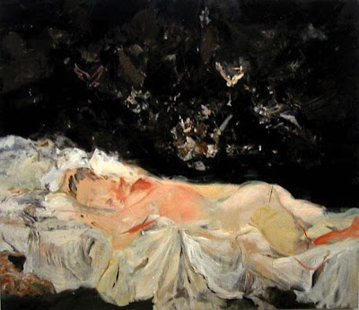
Generally her titles can be misleading, but in this series she is clearly acknowledging the link with the late works of Goya. The paintings depict sleeping nudes haunted by their dreams; but instead of the owls and demons of Goya’s caprichio “The sleep of reason…” we have winged genitalia.


I don’t know what she has used for a source image, but I presume they are based on her own photographs of a reclining nude, but they could be from a magazine or a figure from an old master. I have read nothing to suggest she has worked from life. In this painting, the position of the figure is a mirror image of Goya’s La Maja Desnuda with the oppressive black space behind the white bed linen echoing Goya’s treatment.

Brown often explores the relationship of the audience to paintings and voyeurism is a theme that pervades much of her work. Here the eyes are closed and we are invited to enjoy the eroticism of viewing unobserved. In general I don’t find her work particularly melancholic, but this one is an exception. This is partly to do with the sleeping figure and partly caused by the black background pressing down on the figure.

The canvas size, like all her work, is large giving plenty of scope for paint manipulation and expressive mark making. She draws inspiration for marks and technique from abstract expressionists, notably De Kooning, Bacon and Guston but her work is peppered with references to many artists. Whilst most of her work stands independent of the historical references, this series relies heavily on the association with Goya. For me the reference calls to mind his disillusionment with enlightenment and makes me wonder what if anything Brown is disillusioned with!

The black background has opaque oil daubed, flicked and brushed to create a surface rich in marks and movement. Flesh tones in this piece are warm, but in others in the series they are cooled with lemon yellows and ultramarine blues. The sheets are layers of thin greys and whites with hints of colour and contrast with the background both in colour and style.

She frequently works on a series of paintings at one time; sometimes completing individual paintings quickly, at other times returning to paintings frequently over a longer period. She speaks of trying to spread her ideas across several canvases. Her technique is to work once over the whole canvas, then rework until she feels it is complete. She acknowledges the danger of over-working a painting and wants the illusion of immediacy.

More generally Brown has a great ability to manipulate paint on canvas as well as a rich array of mark-making skills. She does not work from preparatory sketches but prefers to work straight onto the canvas with paint. She leaves her work unglazed, but the paint is usually quite oily adds to the richness.

©blackdog 2009